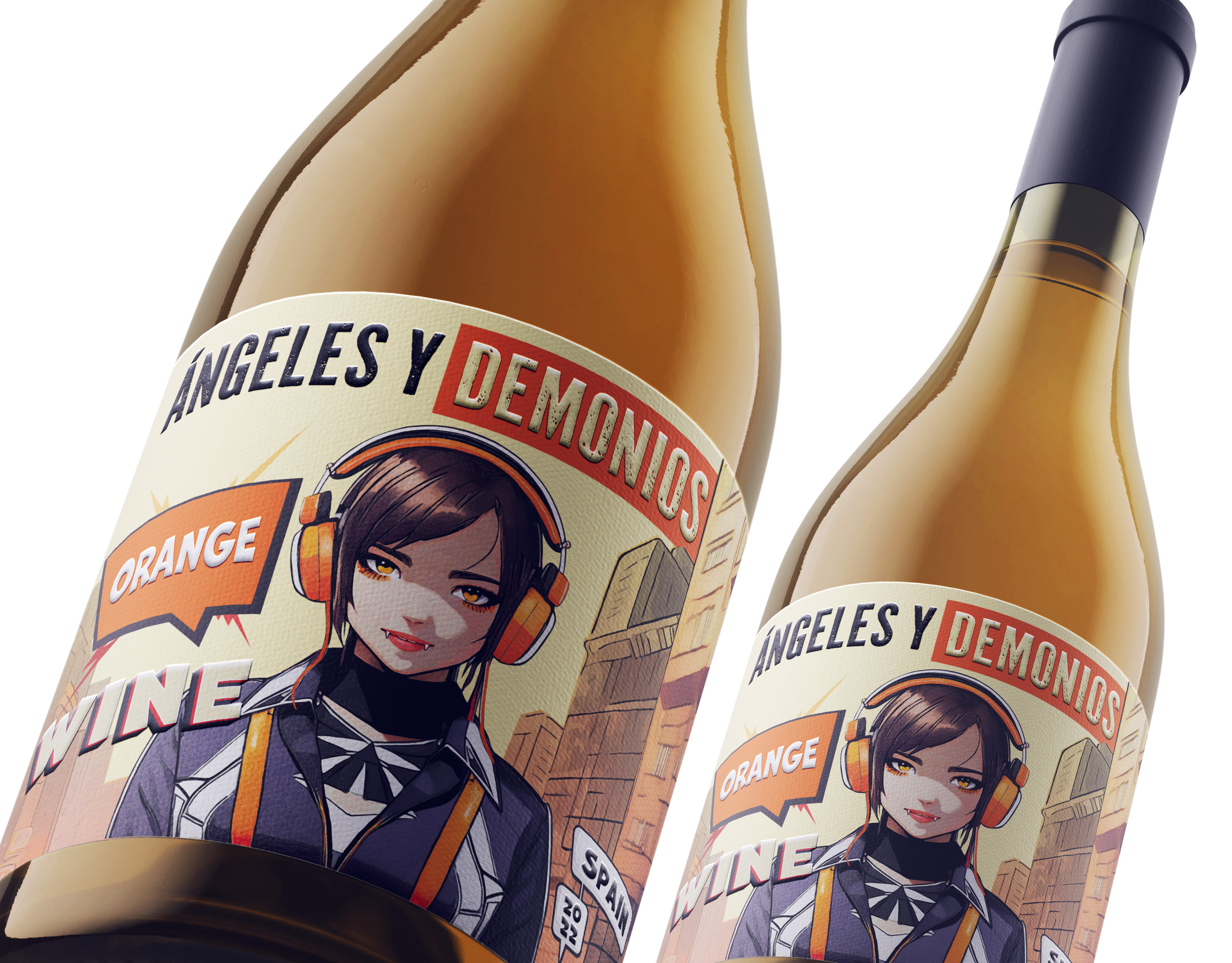
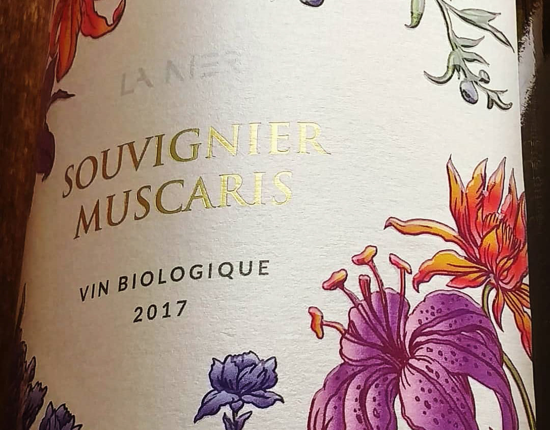
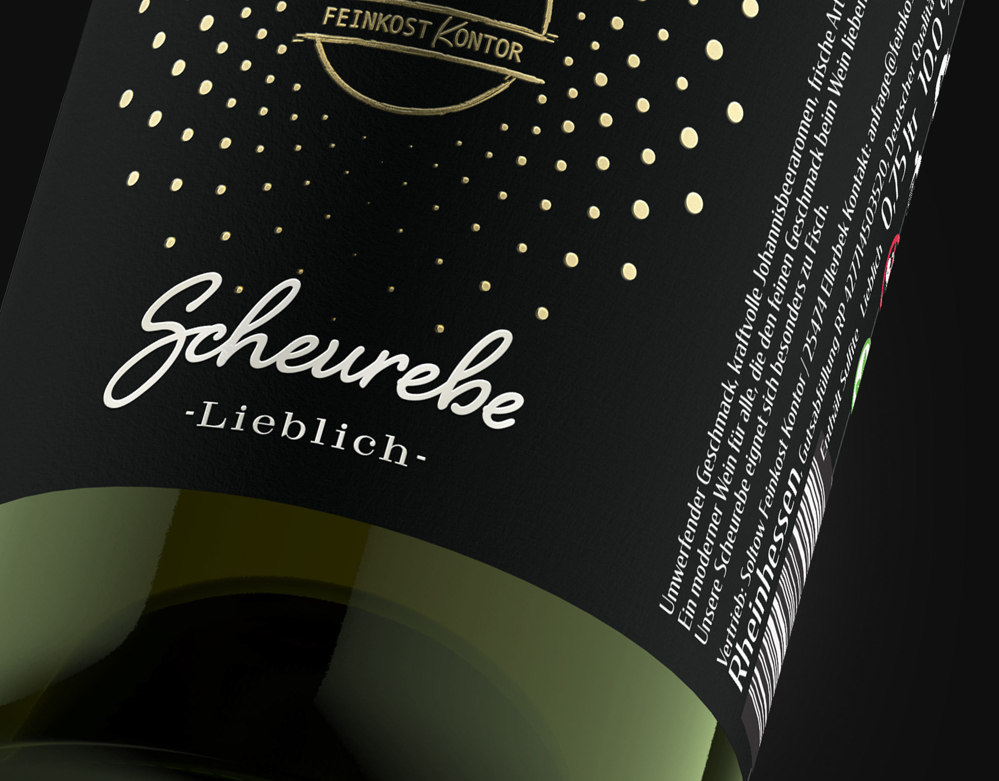
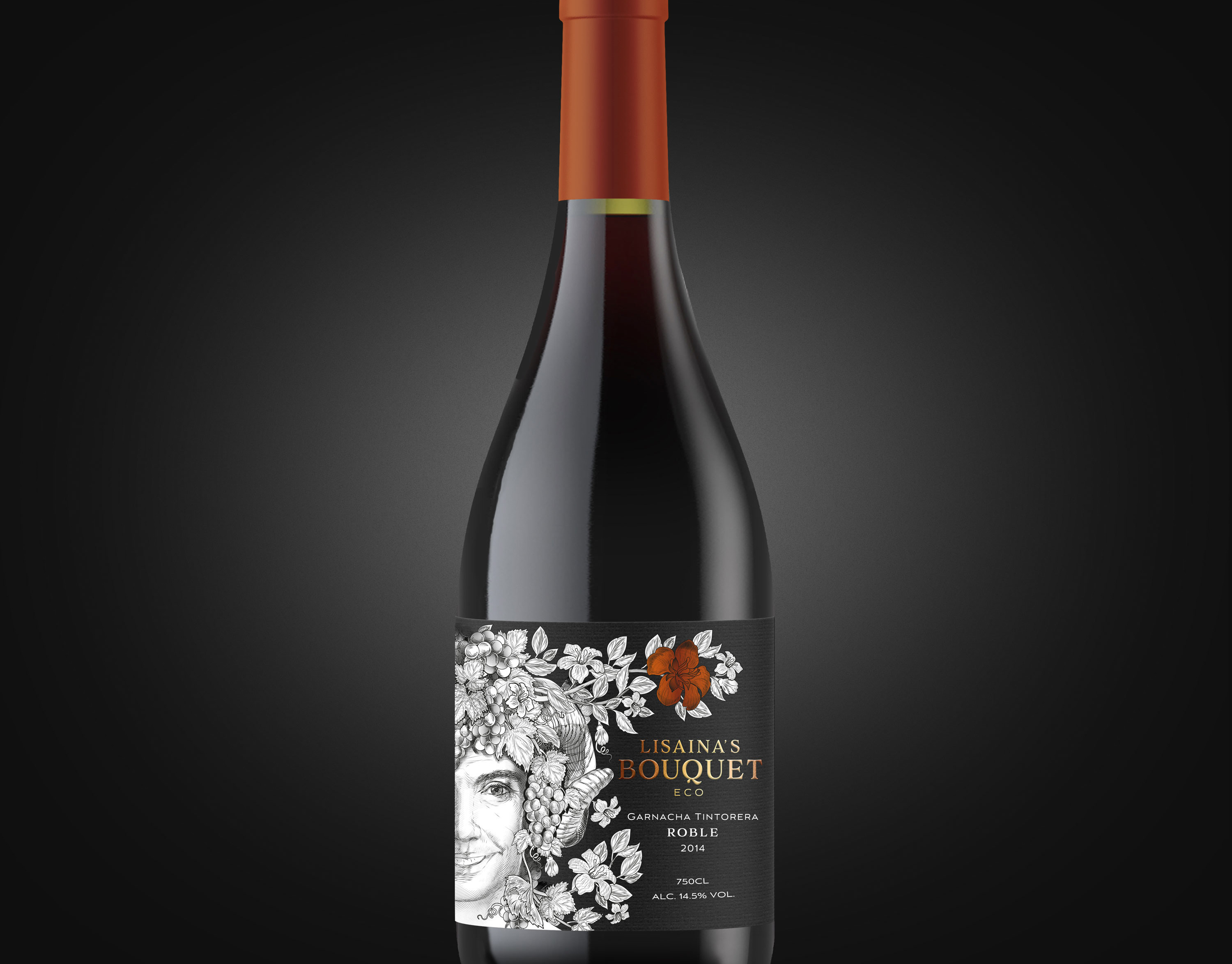
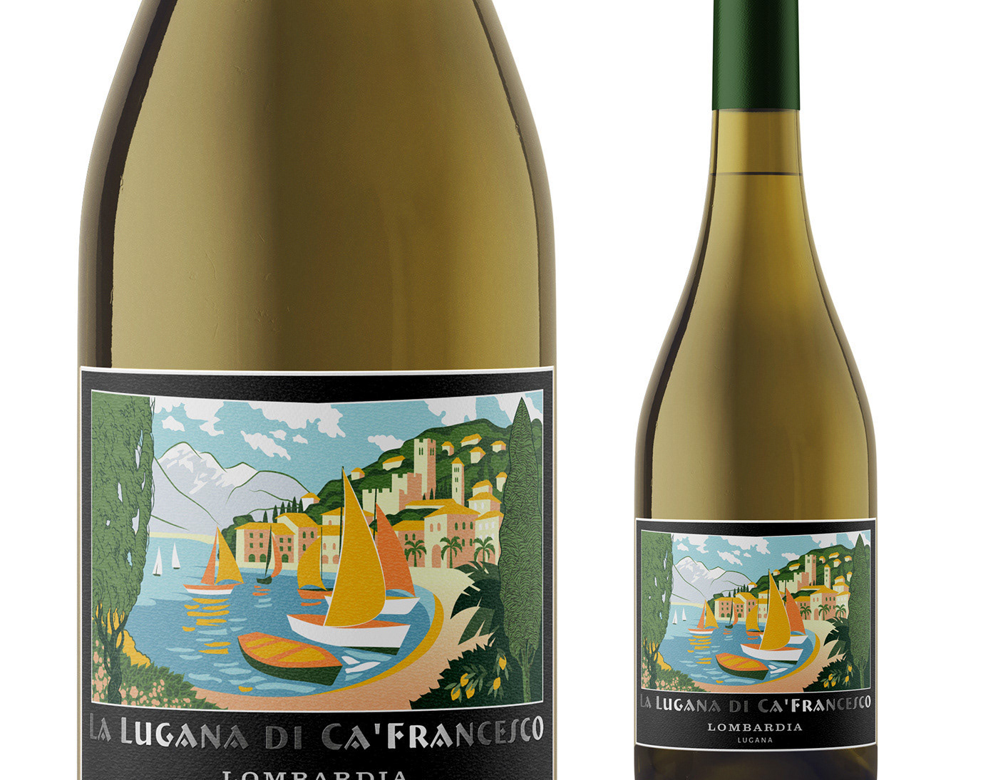
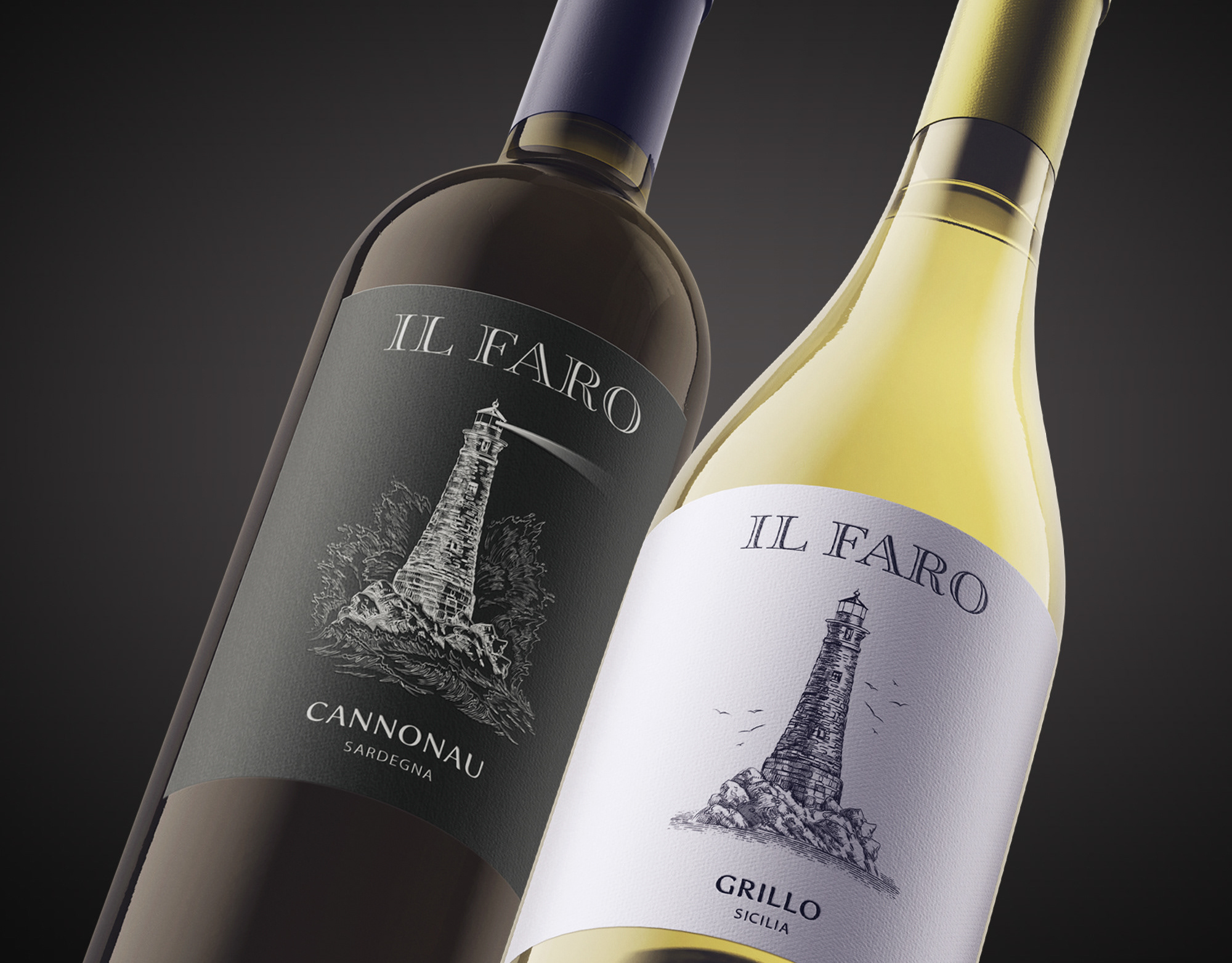
The concept is built around a warm and personal visual language, keeping the composition simple, elegant and contemporary. The subtle repeating pattern adds character without competing with the central message of the label.


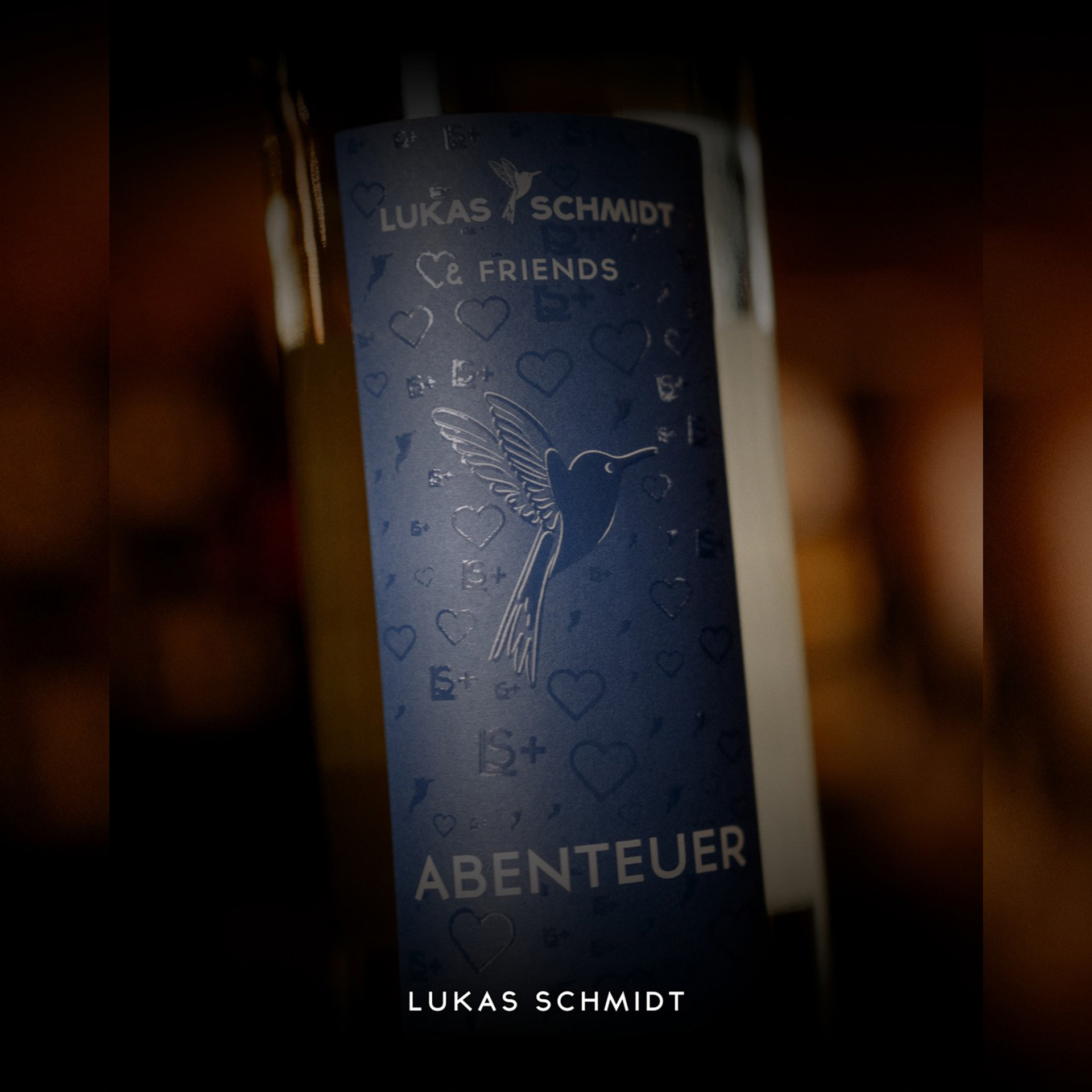

The restrained typography and consistent use of the winery identity help connect the design clearly to the Lukas Schmidt brand, while giving this particular wine its own distinctive and memorable character.
_____________________________________________________________________
If you like our works, we’d be happy to collaborate and create premium design for your product. Feel free to reach out: team@premiumlabel.design / whatsapp: +420 776 246 535 or by using contact form below.
Thank you!