
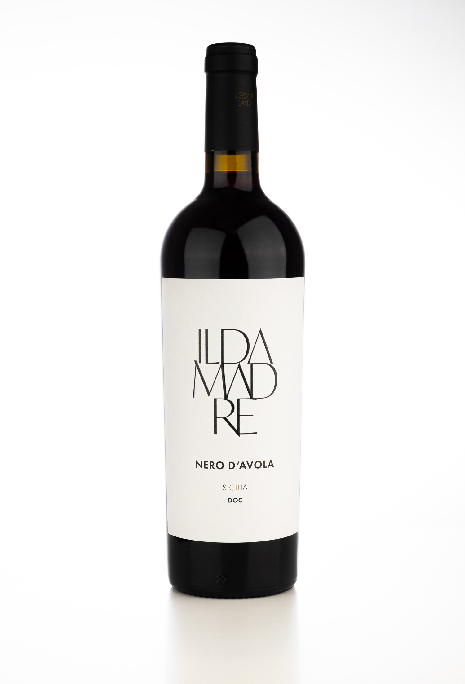
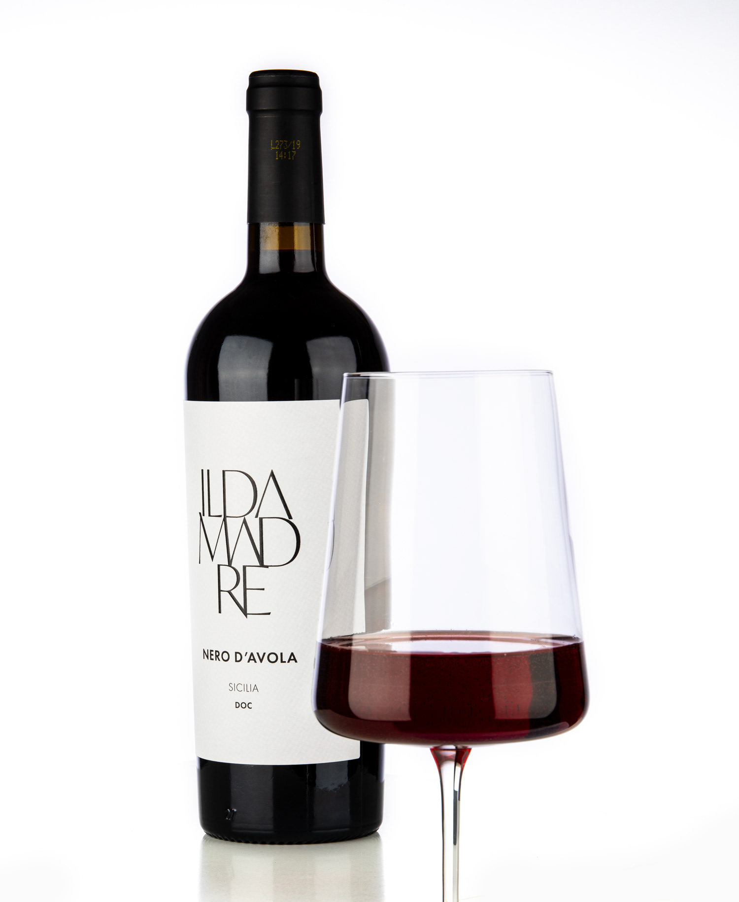
This label design feels both architecturally precise and quietly luxurious. It embraces a philosophy of "less is more," leveraging stark typographic hierarchy to communicate with clarity and sophistication. The aesthetic speaks to a brand that doesn't need to shout, trusting in the quality of its product and the power of thoughtful, restrained design.
Feel free to drop us a line.
Thank you!