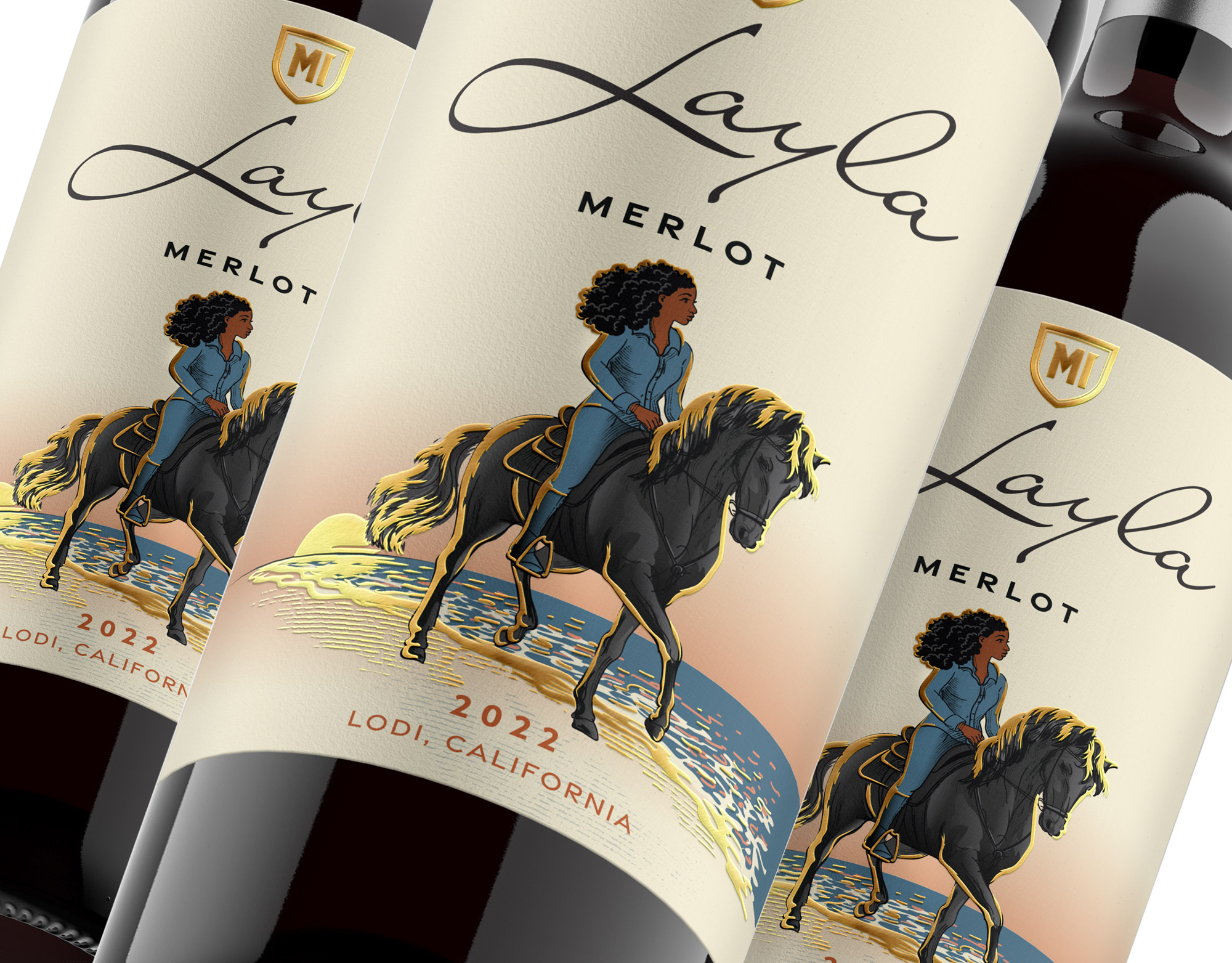

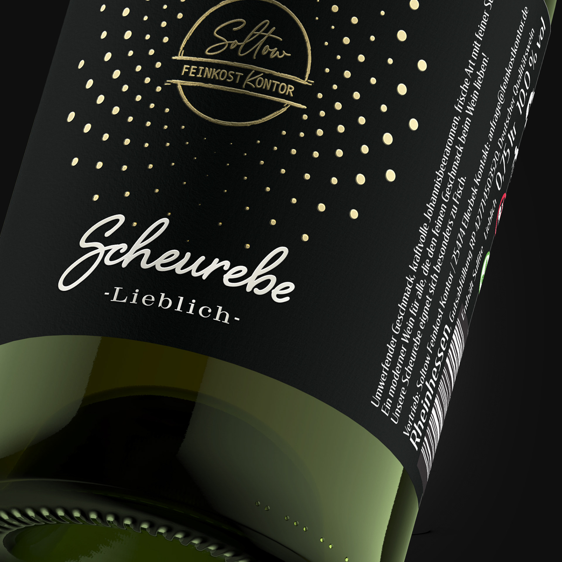
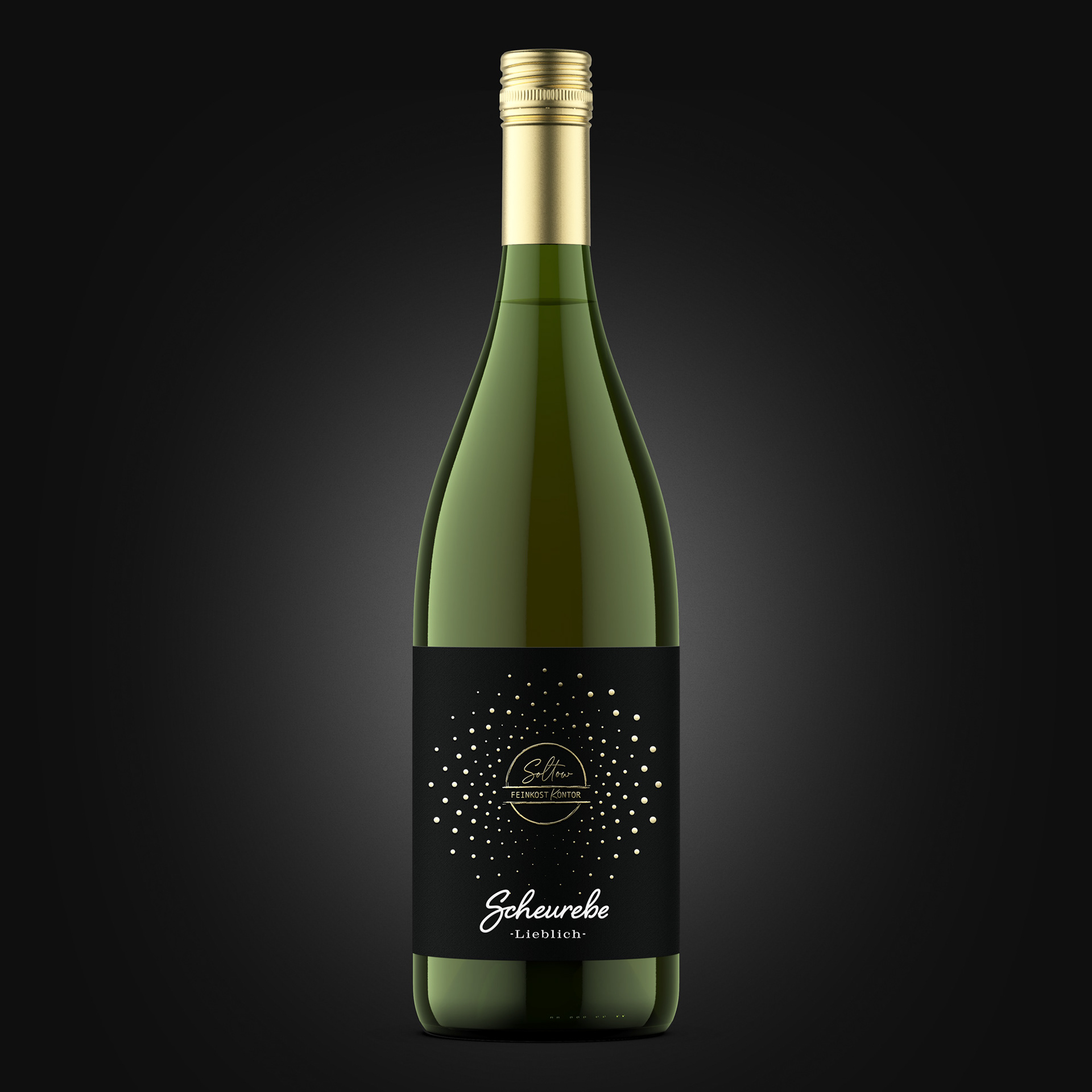
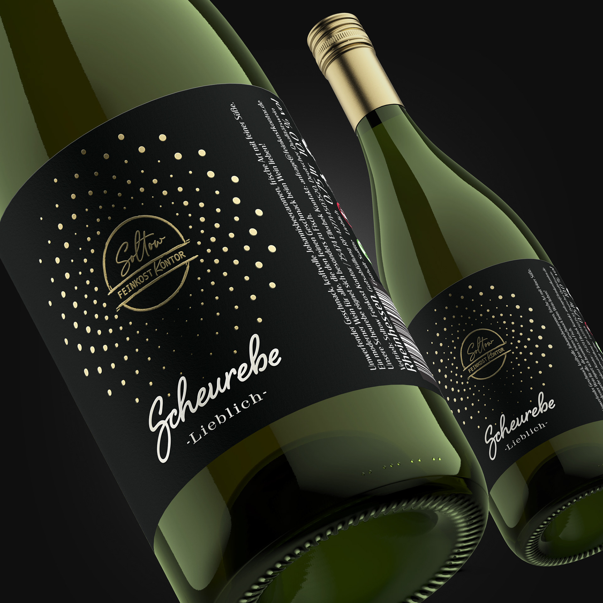
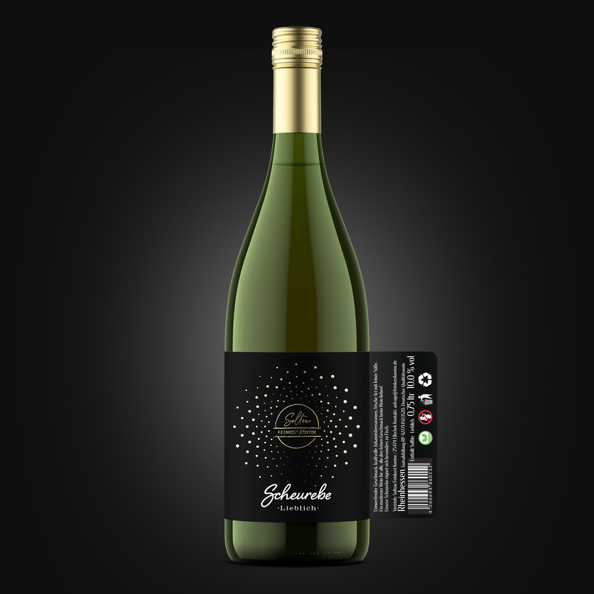
The label successfully bridges the gap between heritage and modernity. It feels knowledgeable and trustworthy, like a well-composed wine journal entry, yet its clean structure and bold primary typography give it a distinctly contemporary appeal. The design doesn't just state what the wine is; it invites the consumer into a story of taste and pairing, making it feel both sophisticated and welcoming.
Feel free to drop us a line.
Thank you!