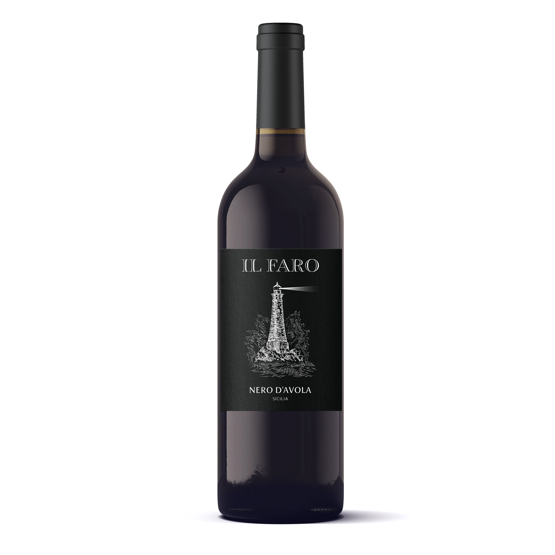
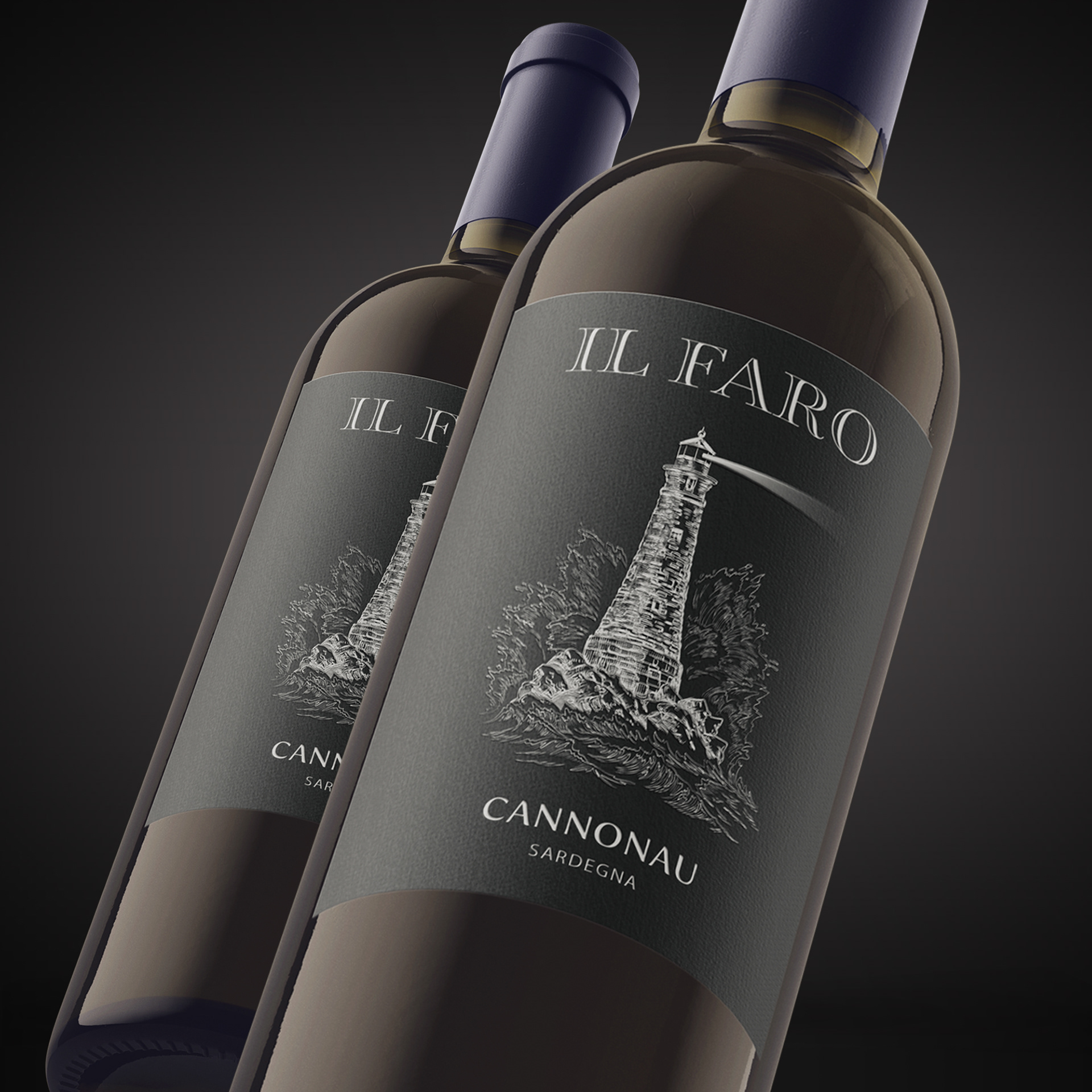
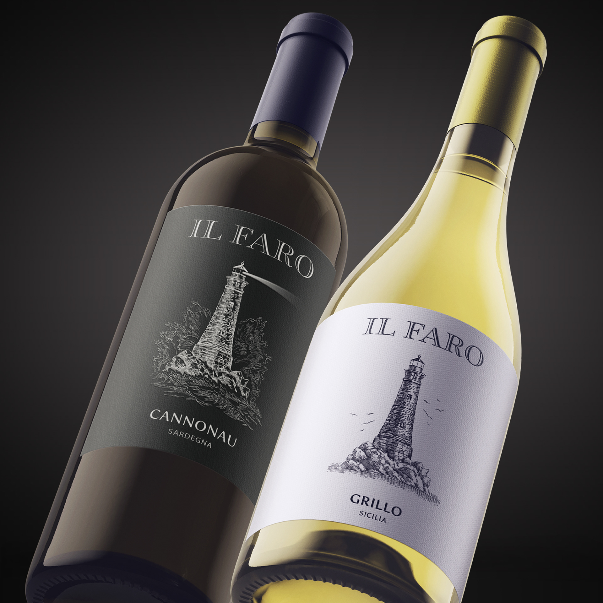
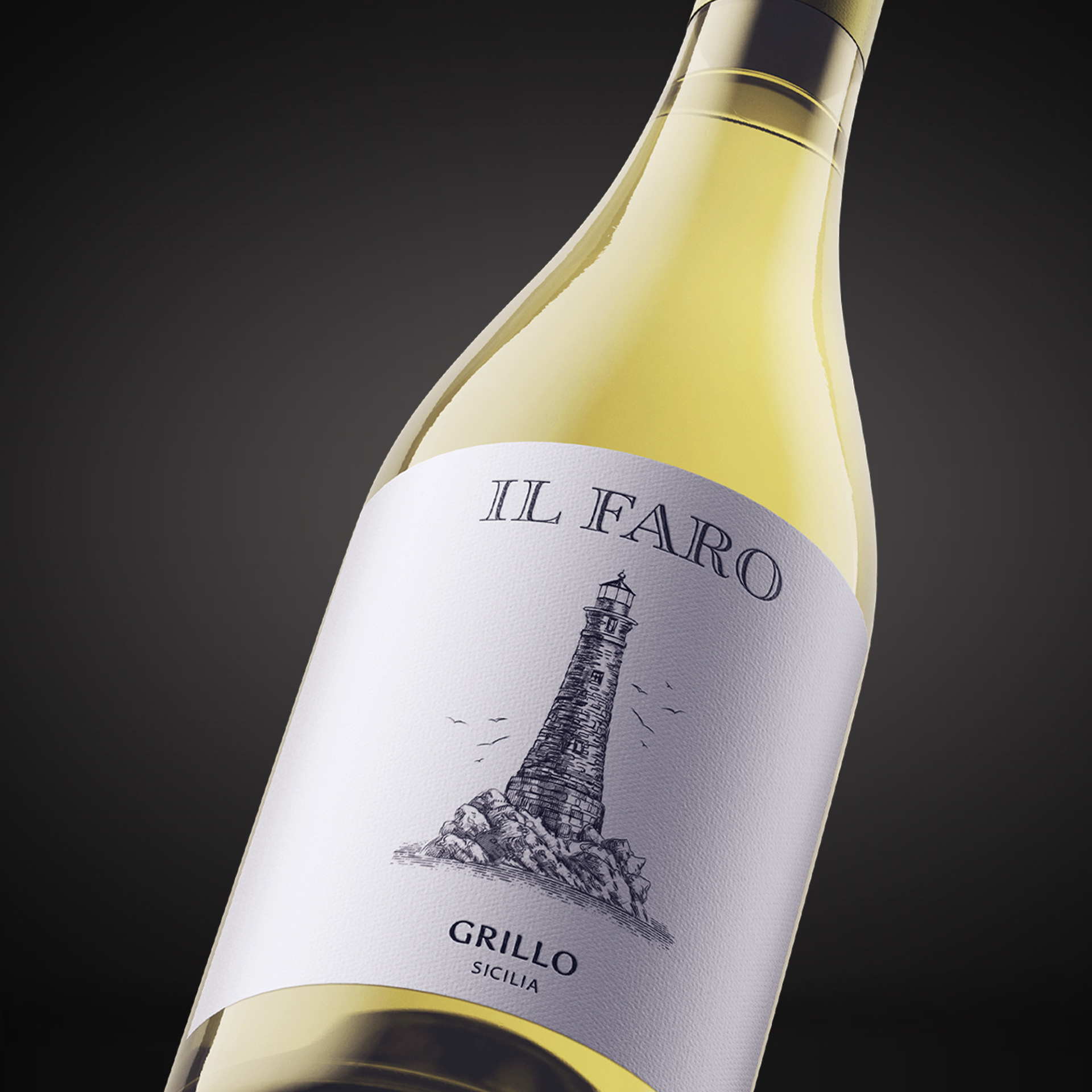
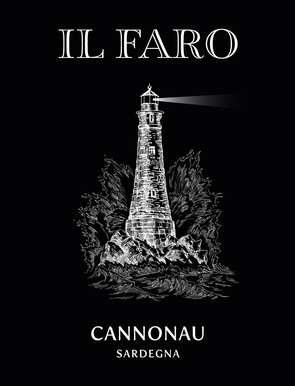
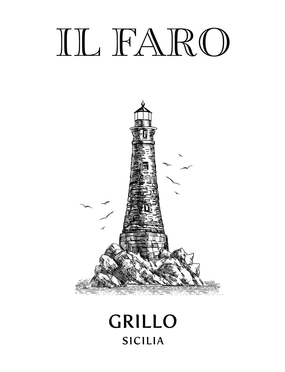
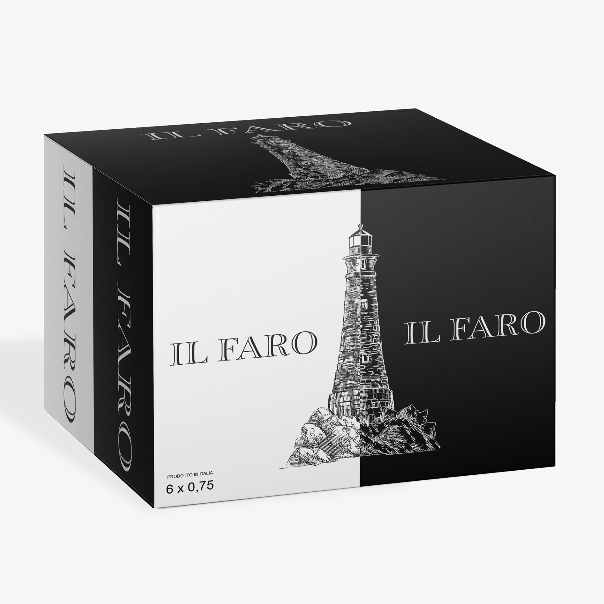
A clean, refined label system designed for Il Faro wines, featuring a hand-drawn lighthouse in stormy weather as the central brand motif and classic serif typography. The red and white varietals are distinguished through contrasting palettes—dark and bold for Cannonau, light and airy for Grillo—while maintaining cohesive typography and illustration style.
Feel free to drop us a line...
Thank you!