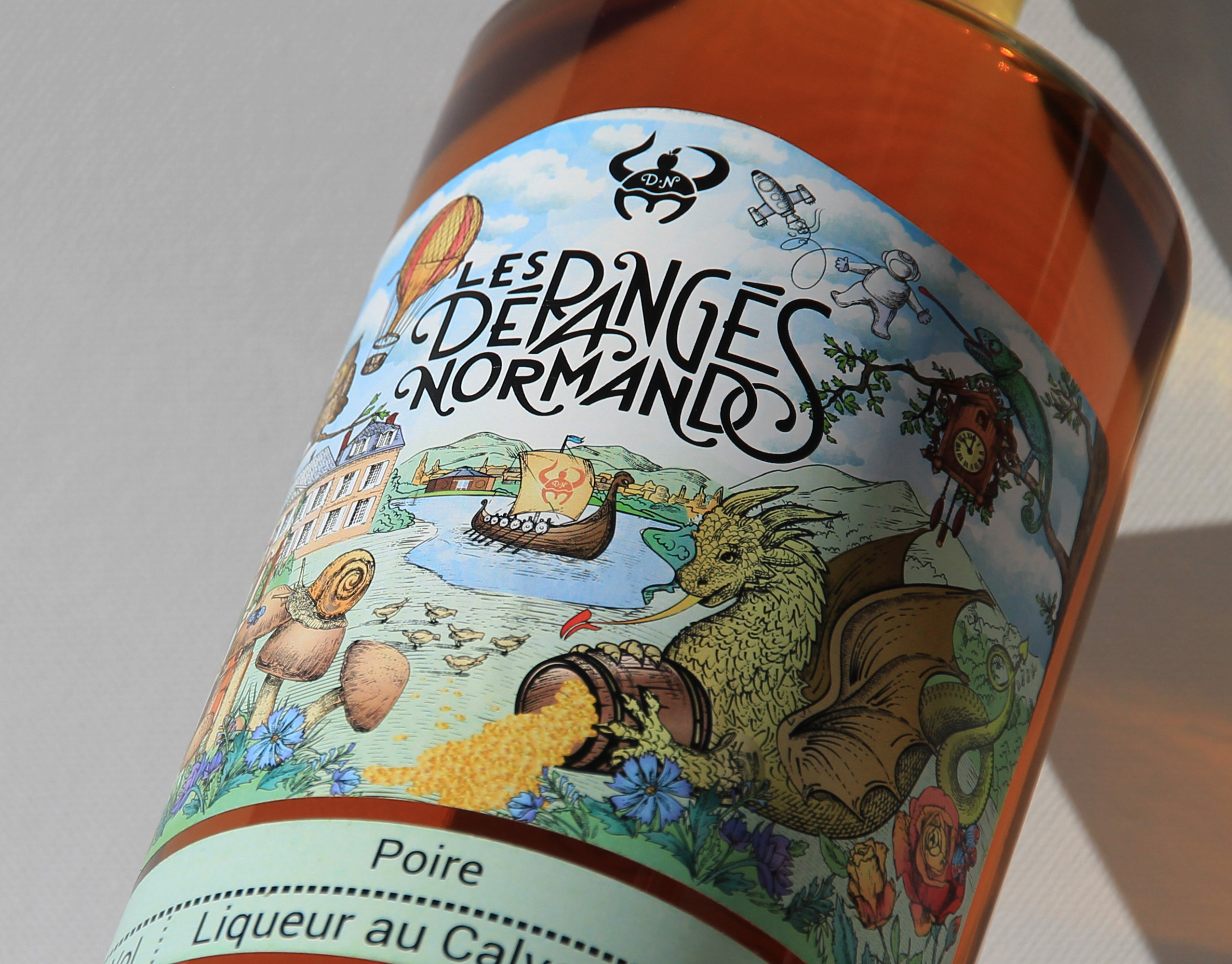
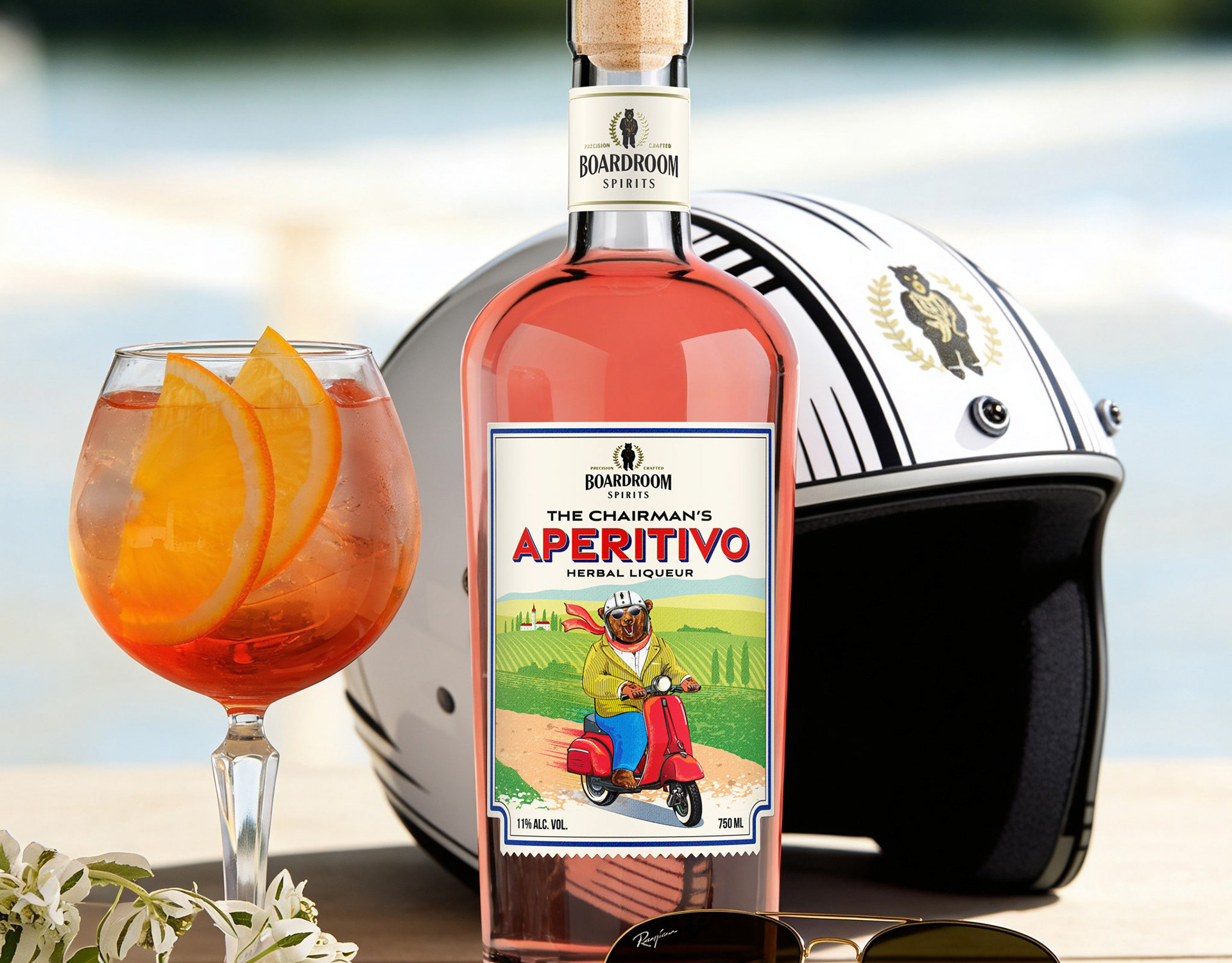
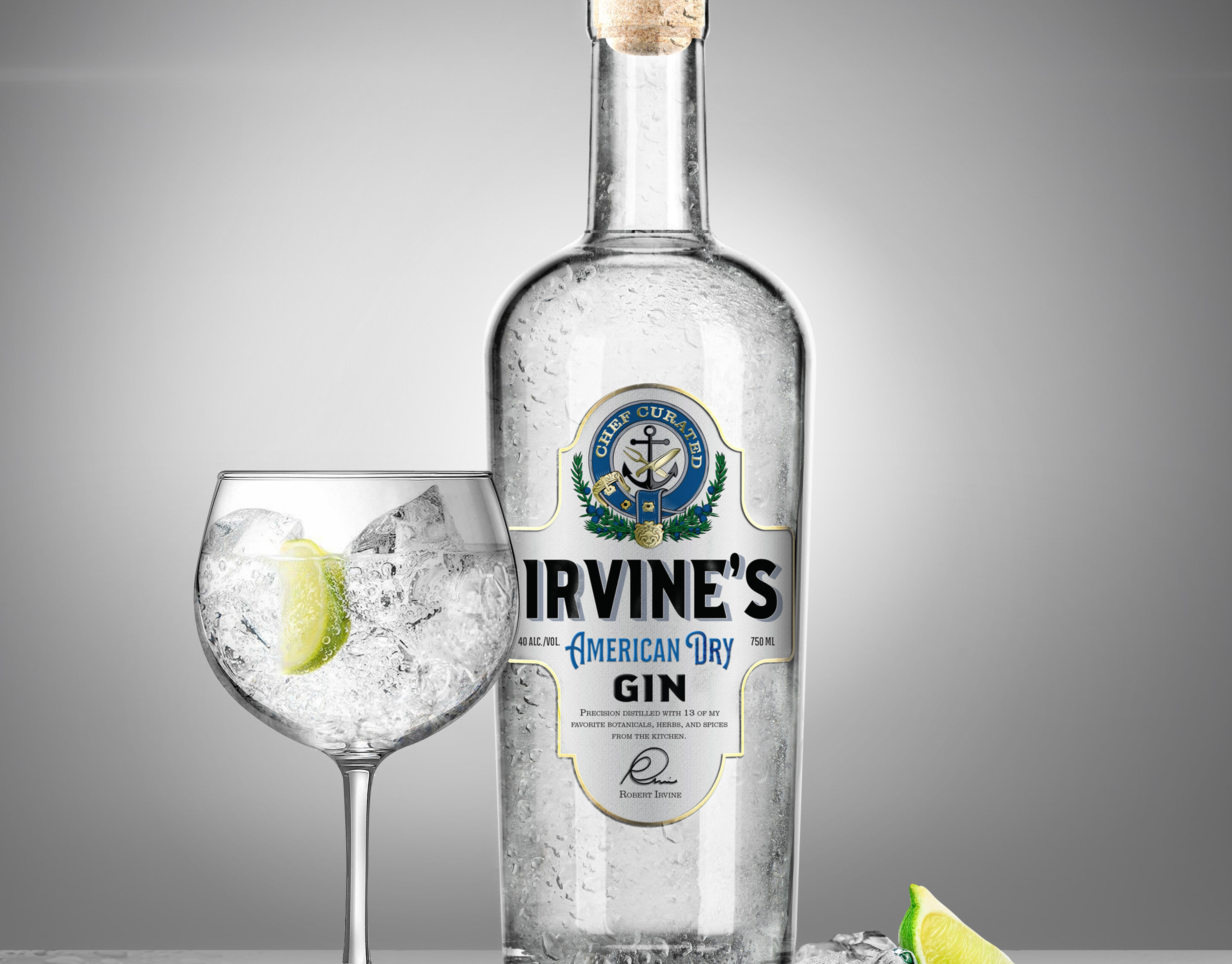
The Highlands - a new take on a traditional Mexican drink. A simple design with a geometric pattern, self-sufficient and striking in its cleanses and sincerity. The logo and label were developed as a unified system, allowing the distinctive pattern to become a recognizable element of the brand while maintaining a simple, confident and premium appearance.
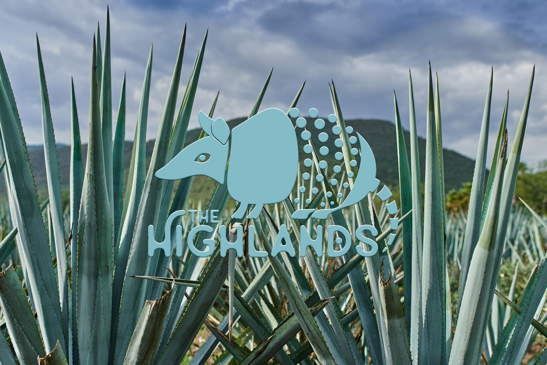
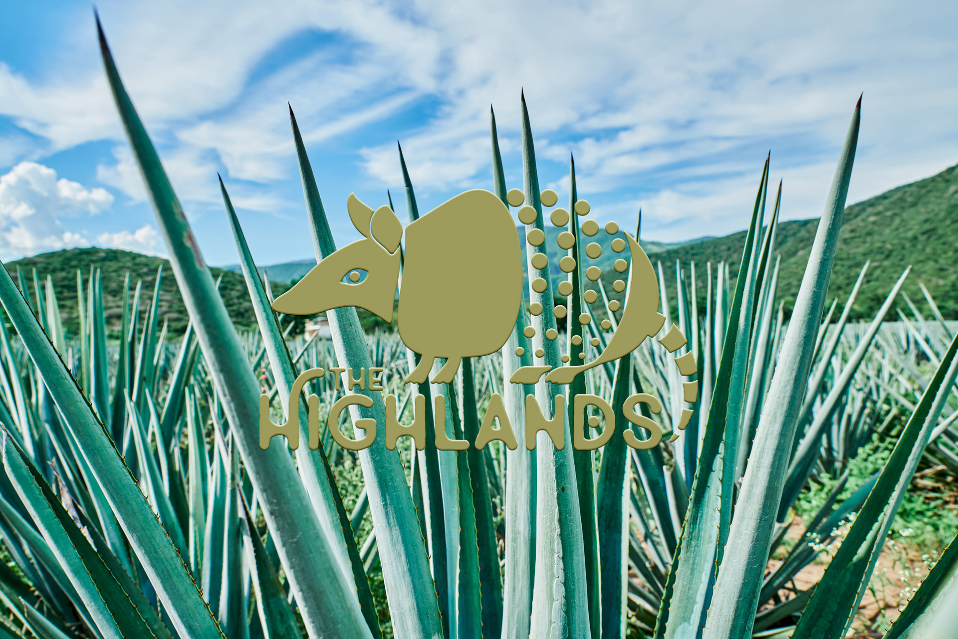
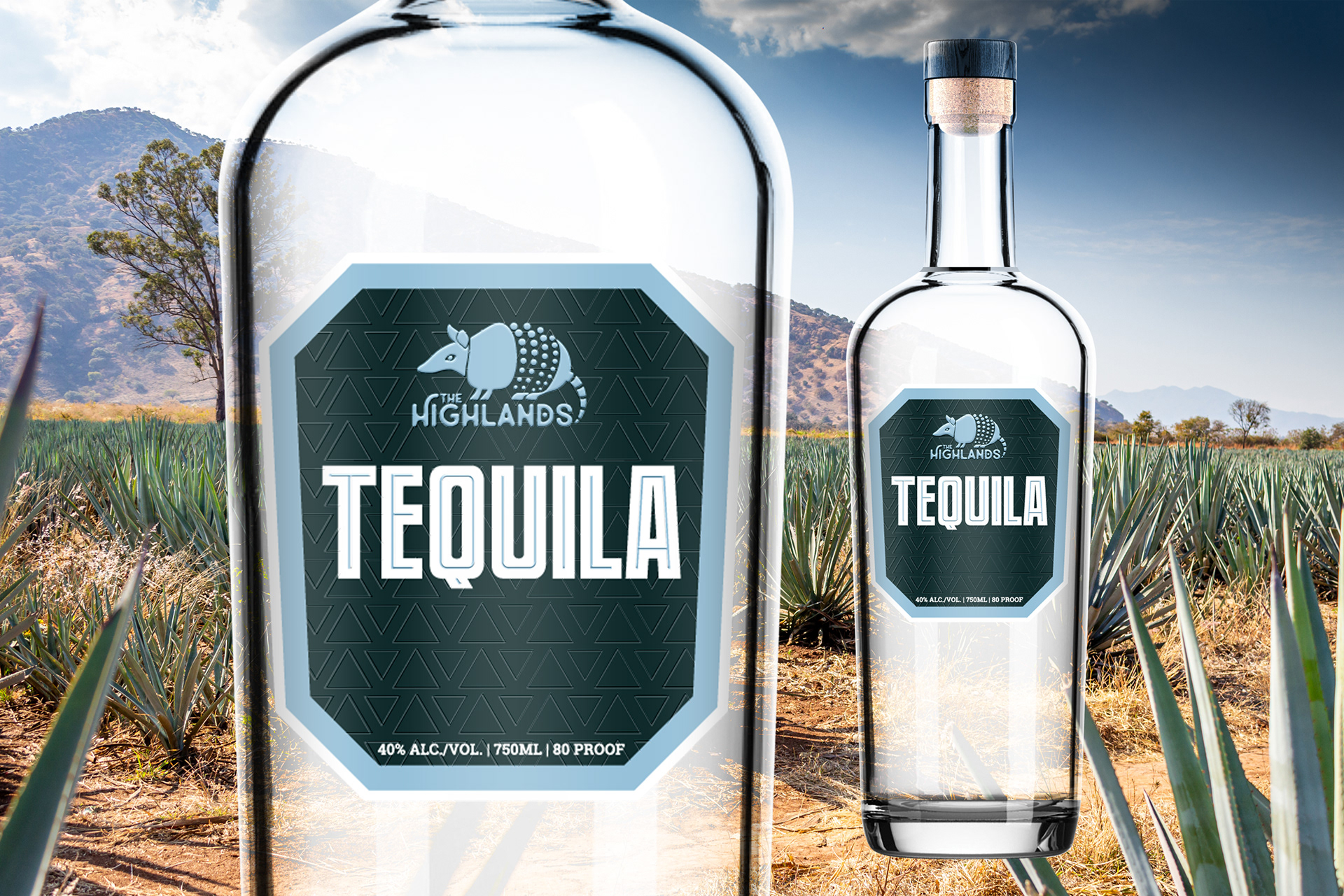
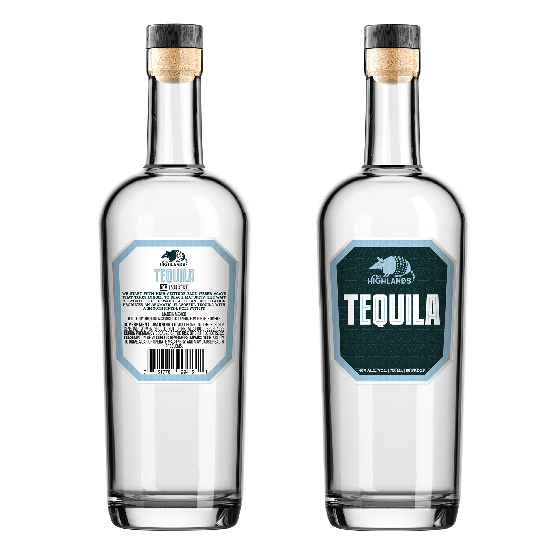
The visual identity combines a bold geometric pattern with clean typography, creating a contemporary interpretation of traditional tequila packaging.
For collaboration ideas, feel free to reach out by email at team@premiumlabel.design, via WhatsApp, or through the contact form below.
Thank you!