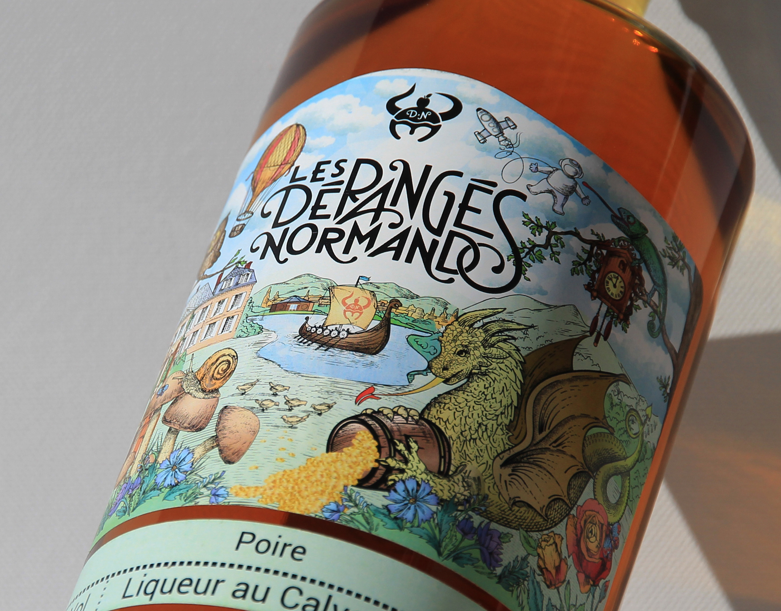

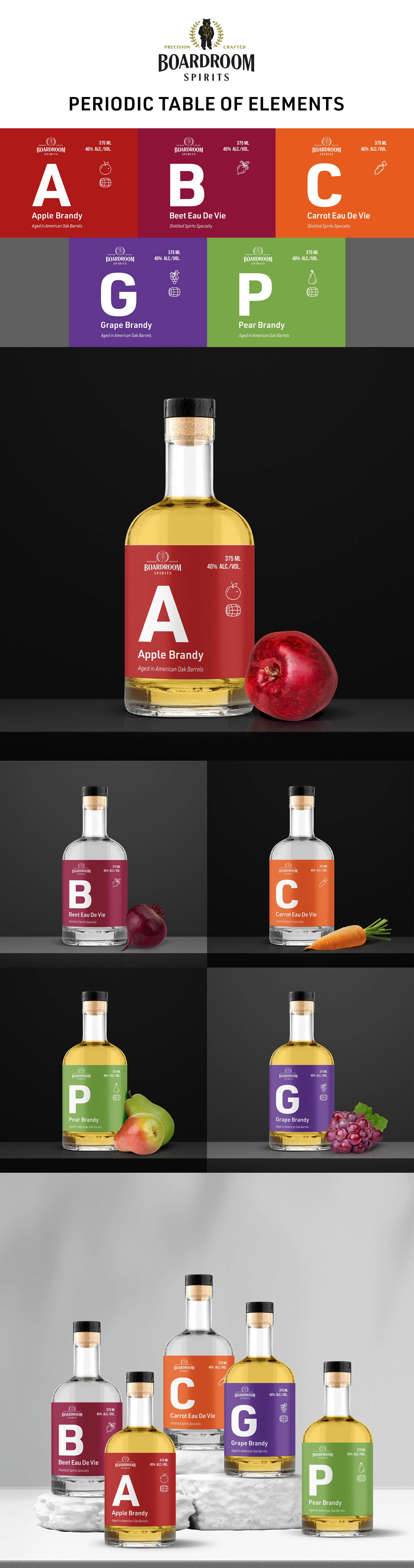
Original concept, which client liked to carry through in the new design, was to create a Periodic Table of Elements for these eau de vie products. A for apple, B for beet, C for carrot, G for grape, P for pear and so on. A portion of the label looks similar to an elemental block.
Feel free to drop us a line...
Thank you!