
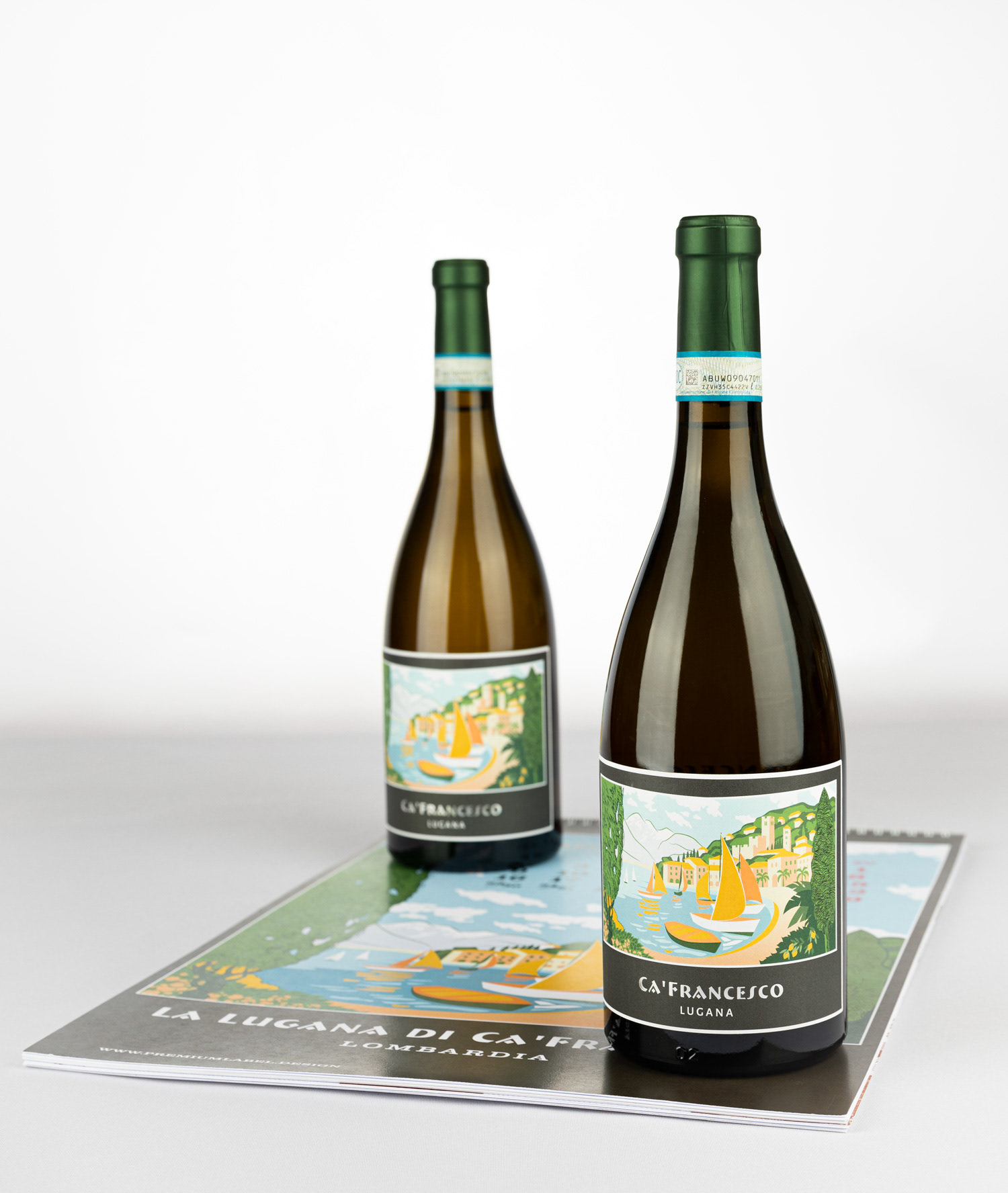
The Ca’ Francesco Lugana label features a vibrant, stylized illustration of an Italian lakeside village, evoking the charm and tranquility of Lake Garda. The artwork uses soft, sunlit tones—yellows, greens, oranges, and blues—to depict sailboats gliding across calm water, framed by lush trees and rolling hills dotted with pastel-colored buildings. The scene has a refined, almost vintage travel-poster aesthetic, suggesting leisure, warmth, and a sense of place.
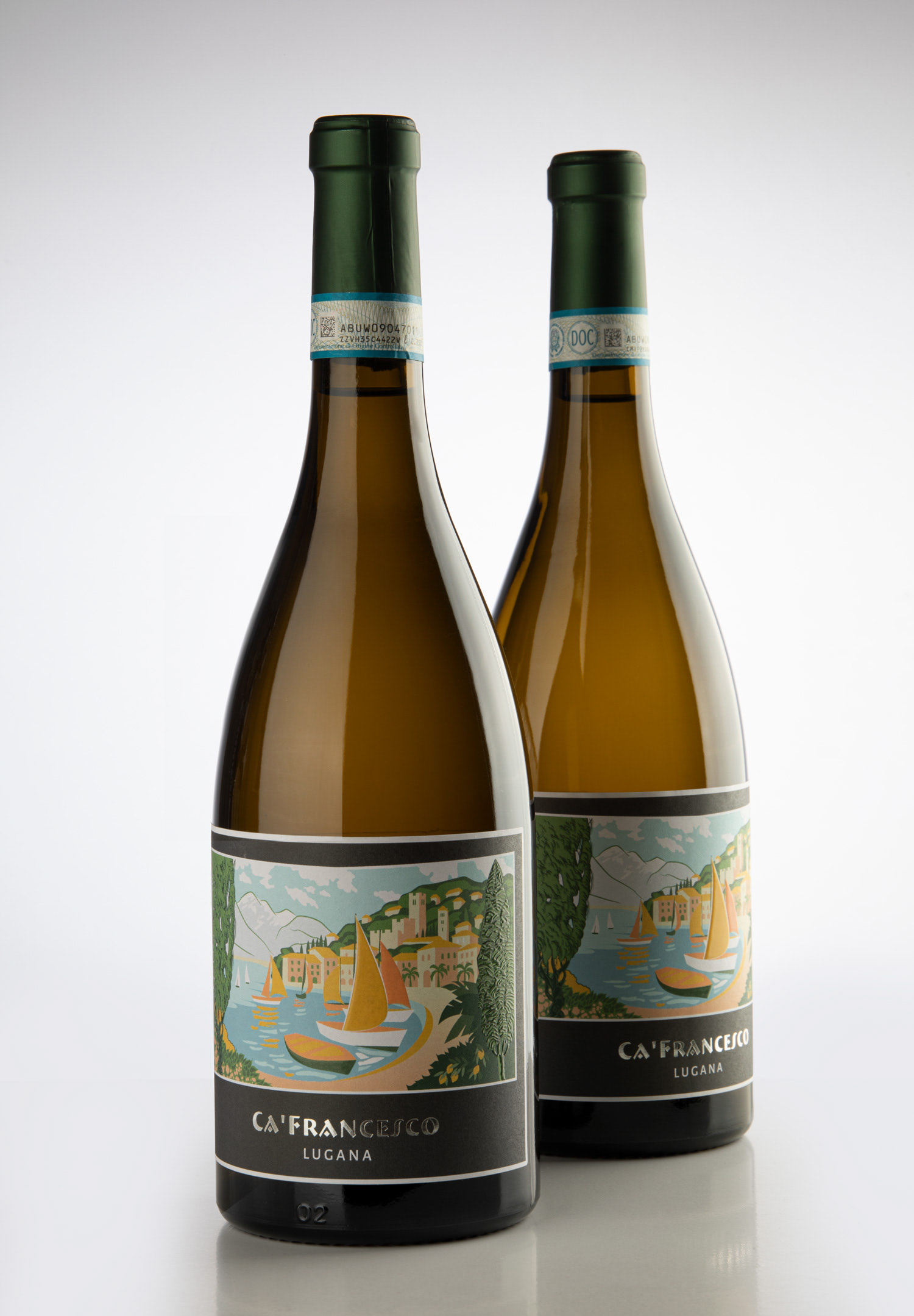
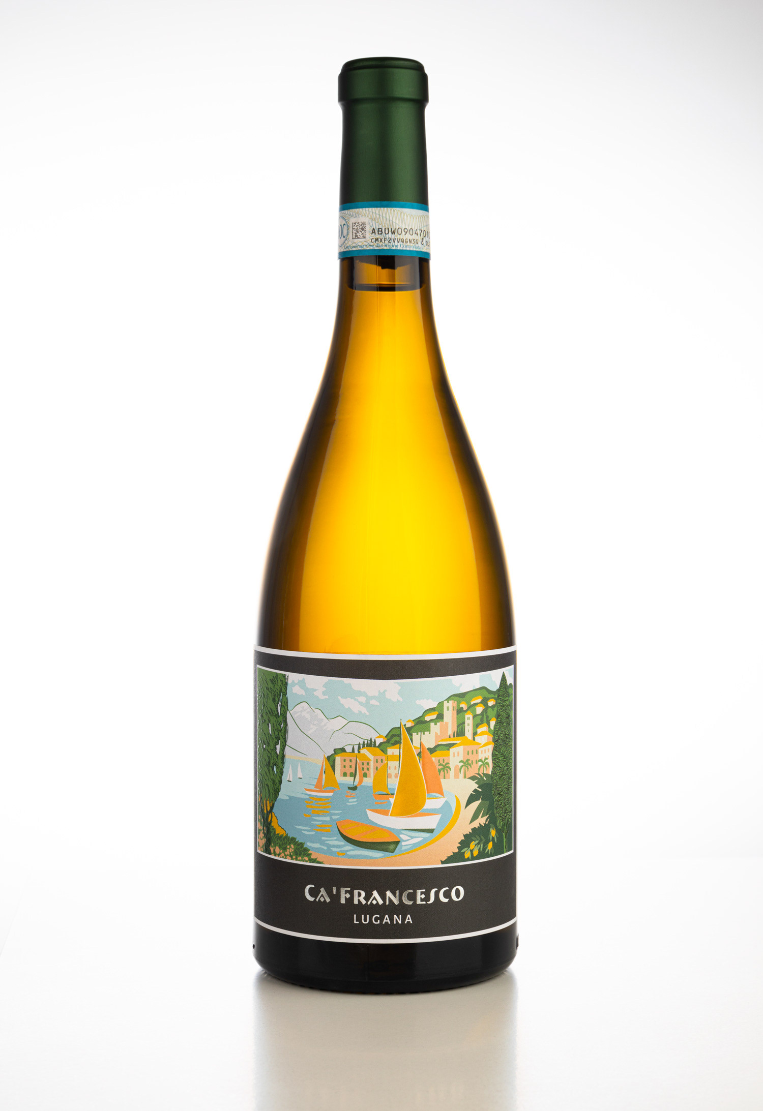
That is the final, approved by client label. Design based on vintage Italian poster artworks.
These were initial concepts with different color sets.
The next step was to remove outlines and give some additional vertical space to the label. Also drawing of mountains on the left became more prominent. Added gold band on the bottom.
Two concepts with different color brightness.
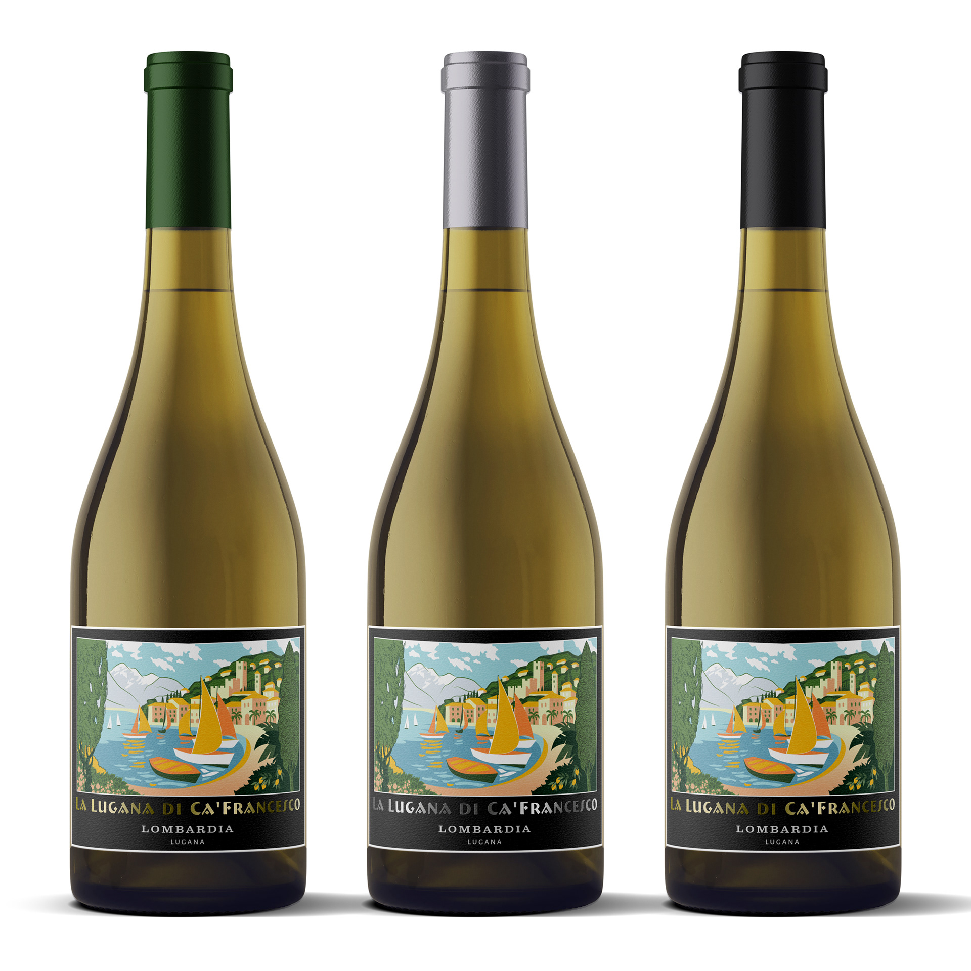
Clients decided to do without gold band and these were 3 amended concepts from which they choose one with silver brand name text.
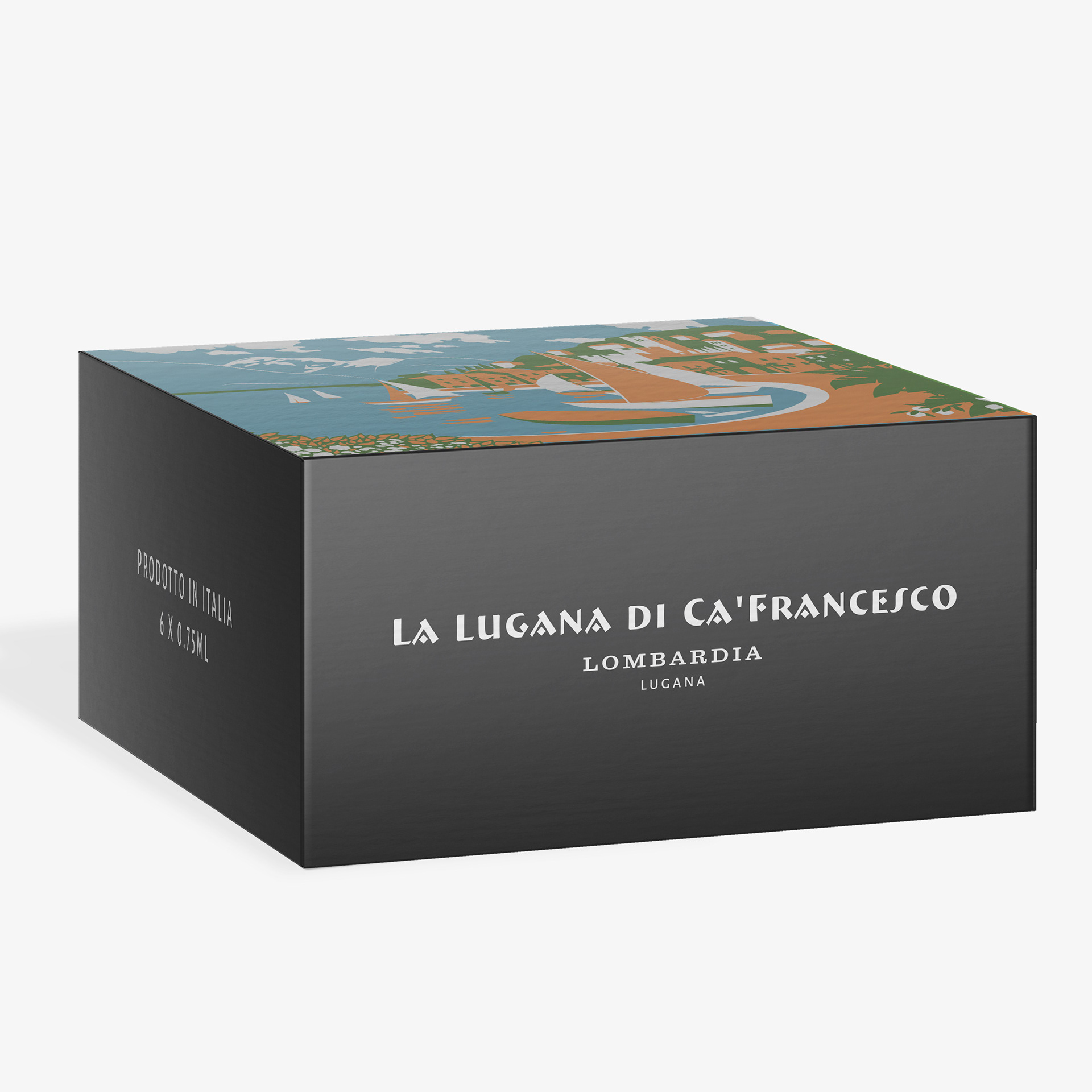
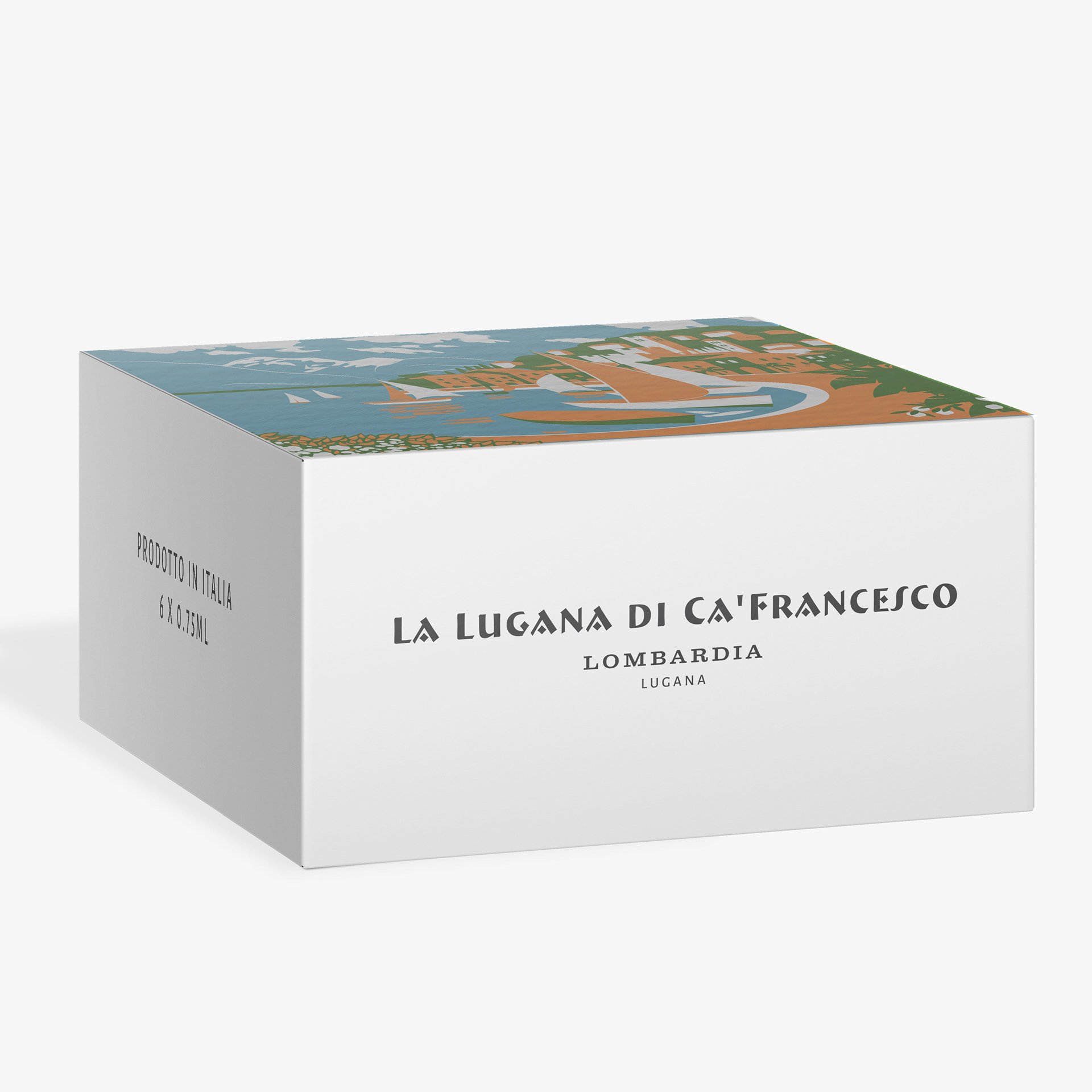
Carton boxes design