
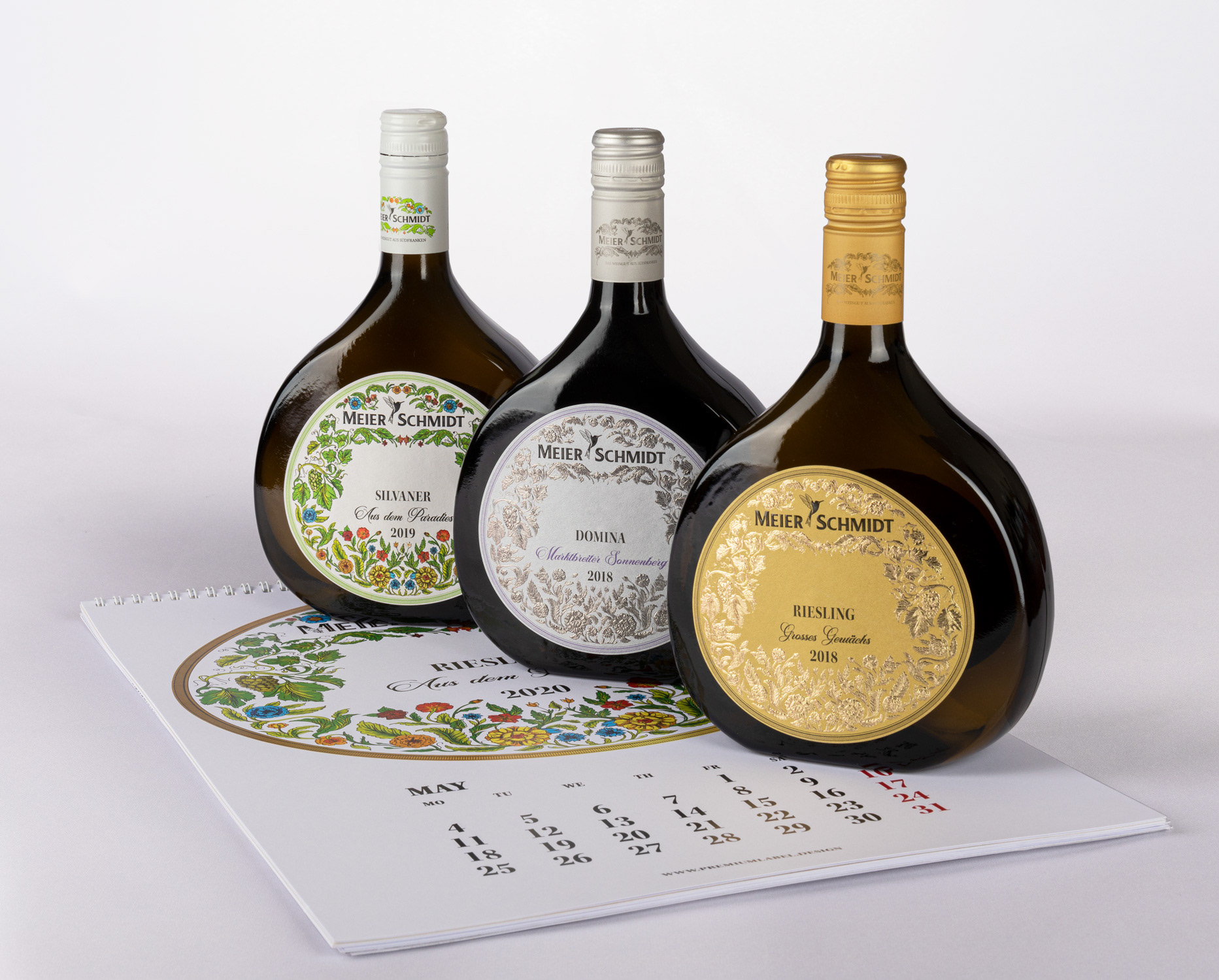
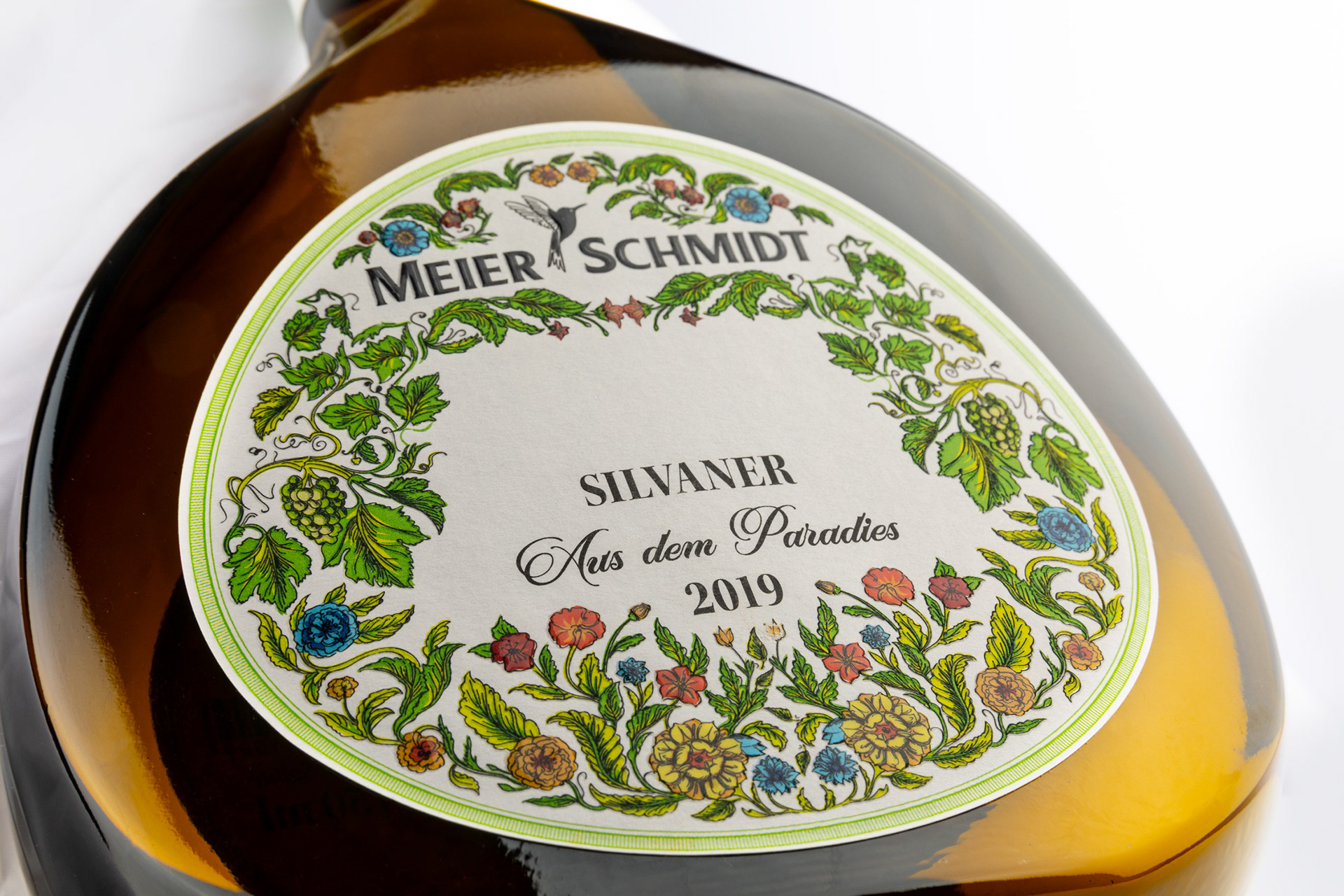
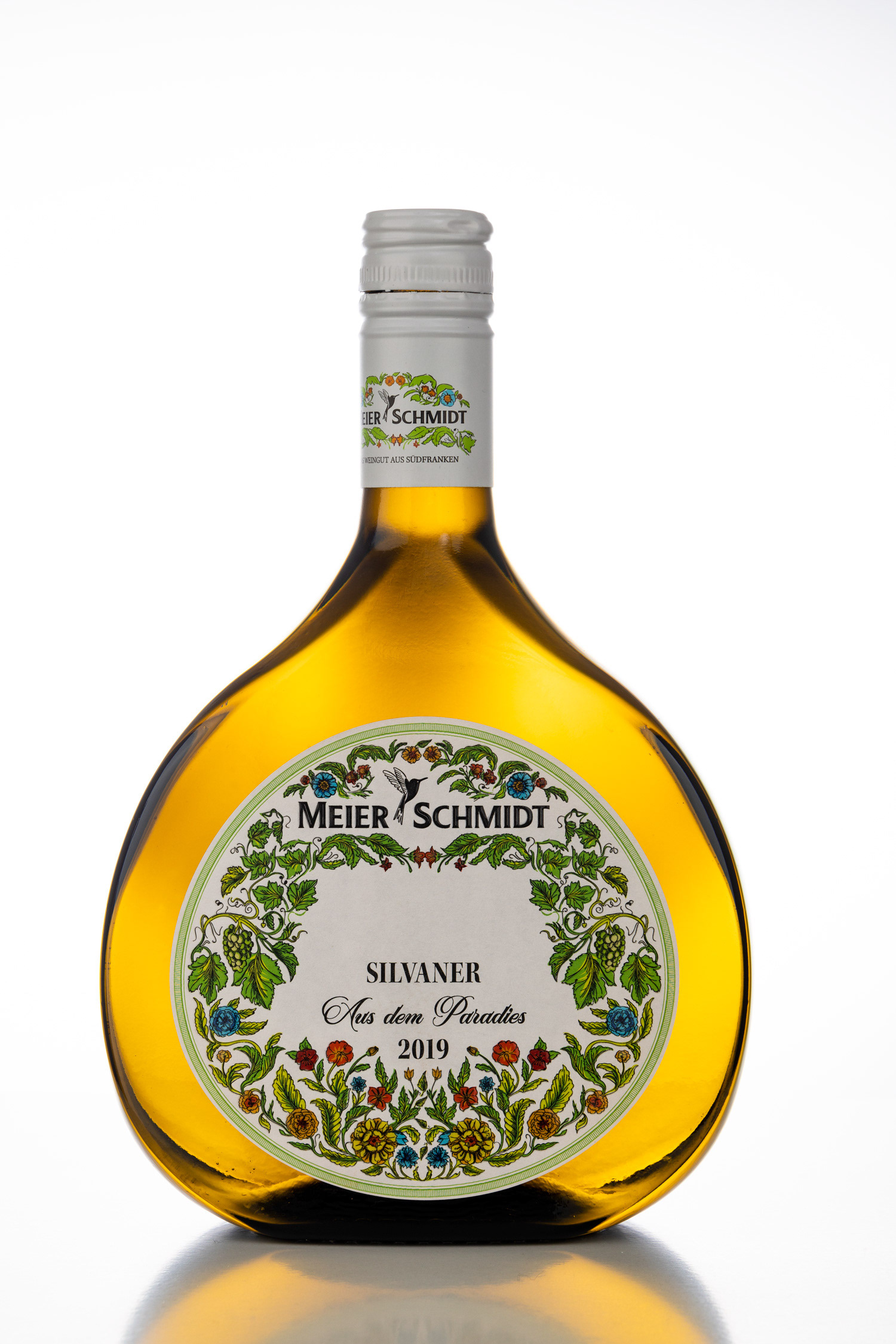
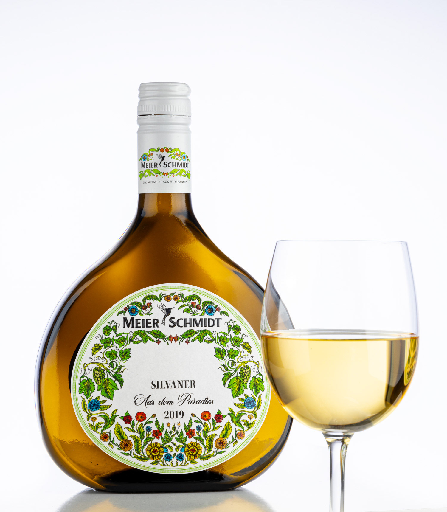
This project involved designing a series of wine labels across three price tiers. The entry-level wines were branded Aus dem Paradies (“From Paradise”) and featured colorful, fully hand-drawn artwork inspired by an 18th-century vintage style, depicting a lush garden of paradise flowers.
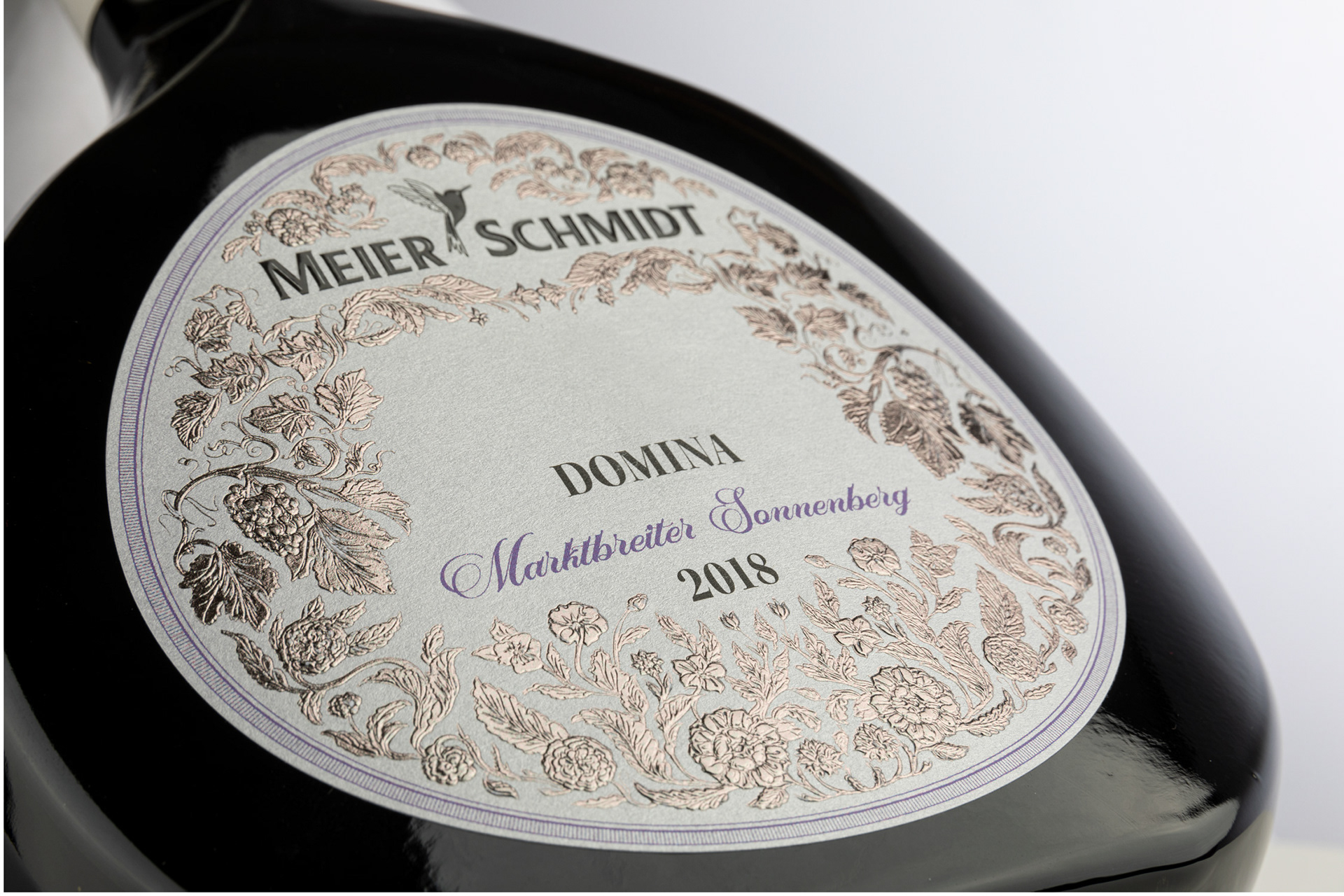
The second tier retained the same illustration elements but replaced color with elegant silver foil stamping on a light grey background.
The premium tier used gold foil stamping on a soft orange background, offering a refined, elevated finish while maintaining visual continuity across the range.


Feel free to drop us a line.
Thank you!