CA'DEL PRATO is a classic Italian wine label concept built around elegance, tradition and understated sophistication. The design combines refined typography with carefully balanced decorative elements, creating a timeless visual identity inspired by the heritage and character of Italian winemaking.
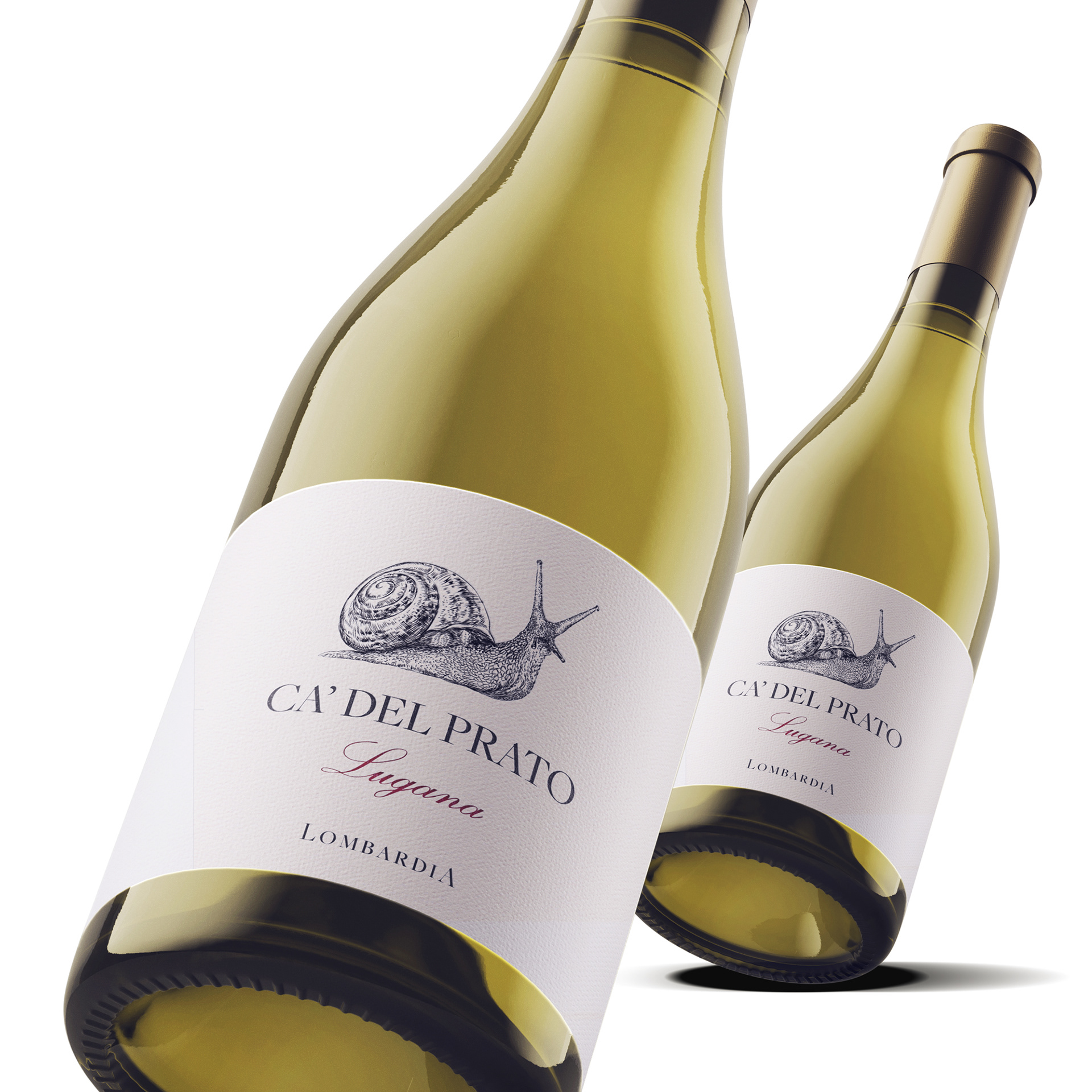
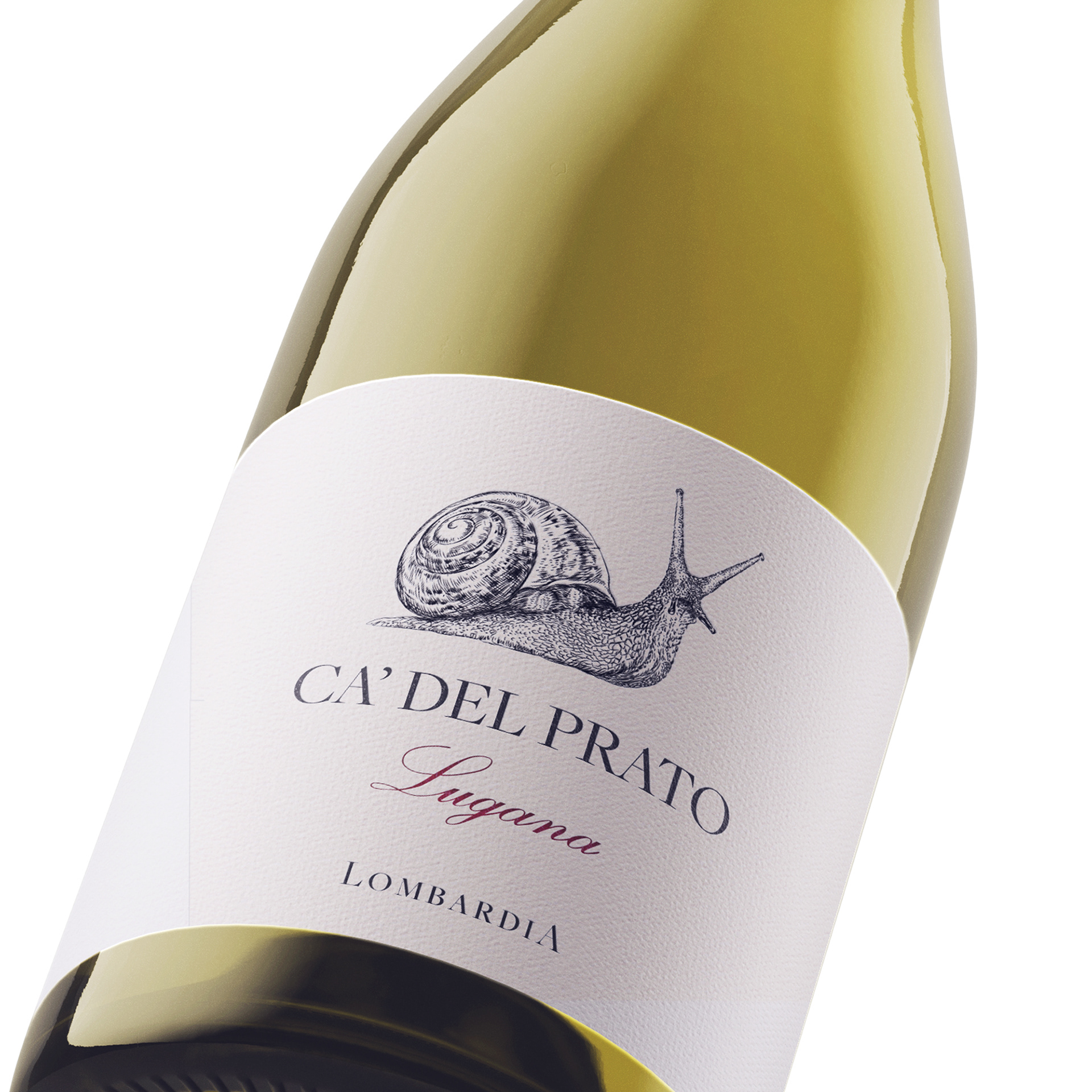
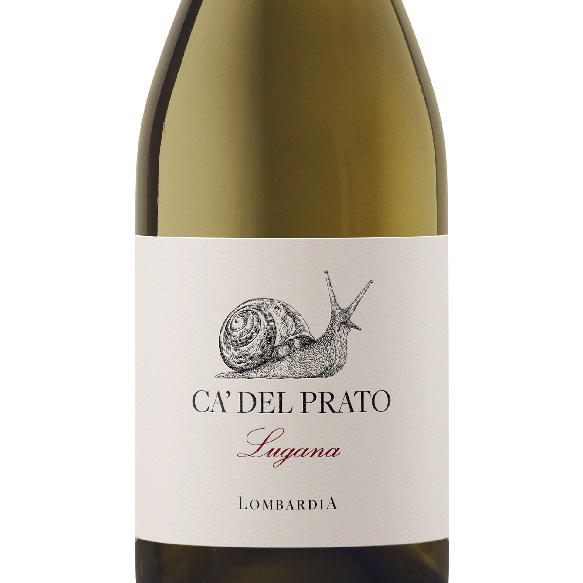
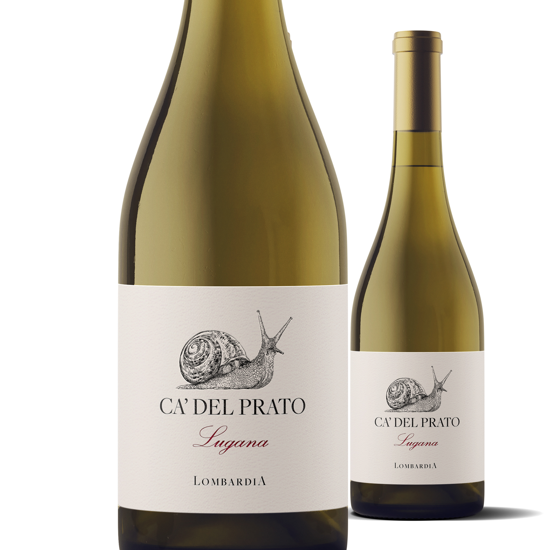
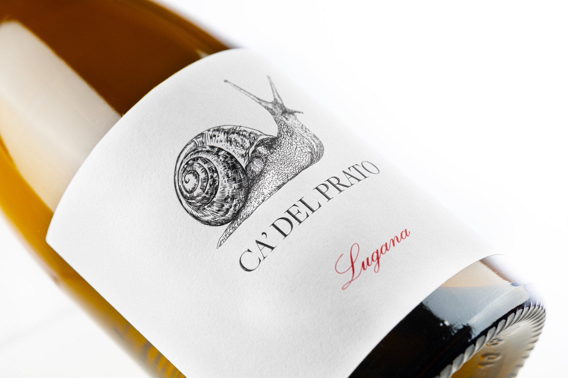
The restrained composition allows the details of the label to stand out without overwhelming the bottle. A consistent visual language brings the different wines together as a recognizable collection, while subtle variations give each label its own individual character within the CADEL PRATO range.
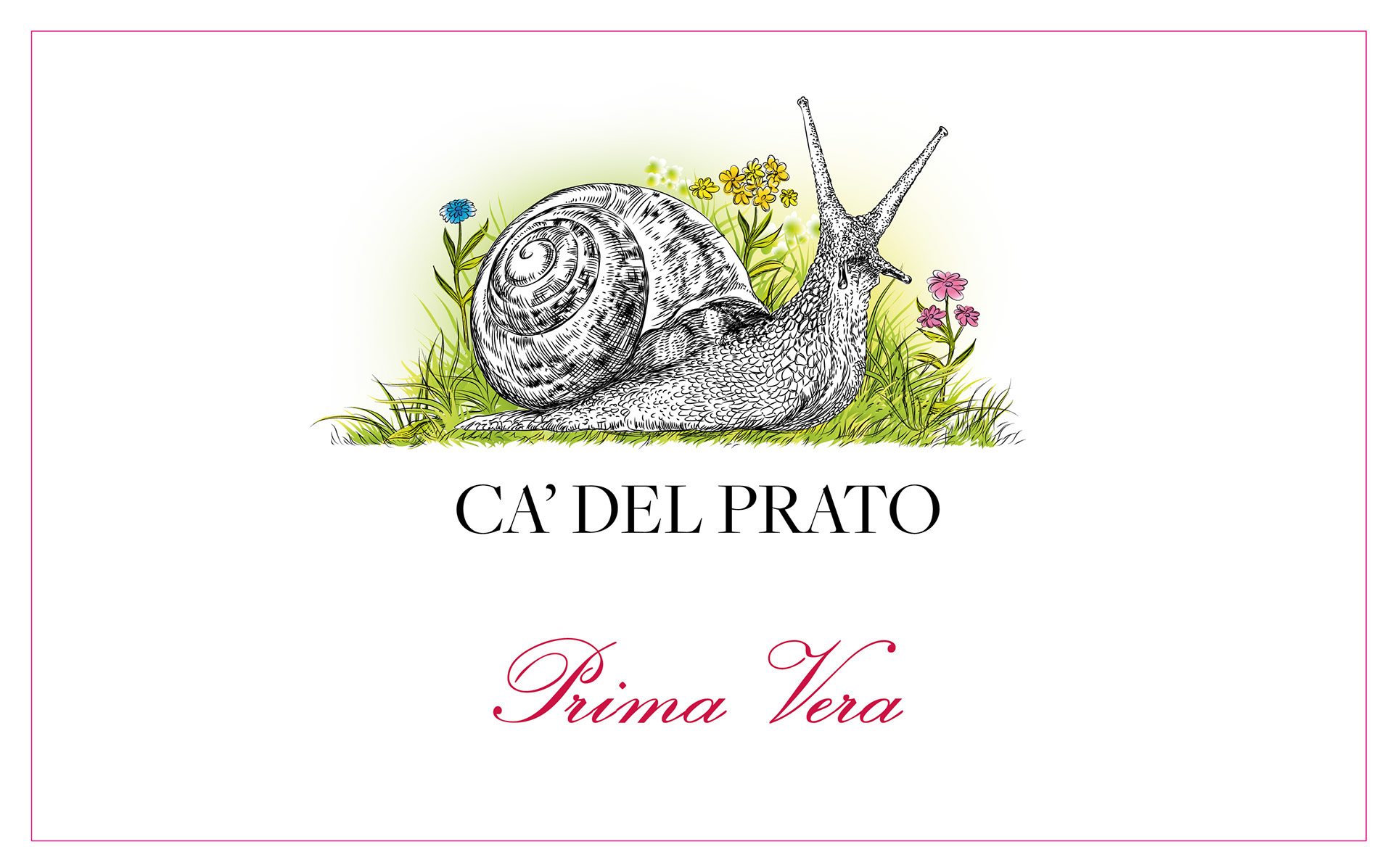

Prima Vera is a lighter, more expressive variation of the CADEL PRATO label, maintaining the refined character of the collection while introducing a fresh and distinctive visual accent.
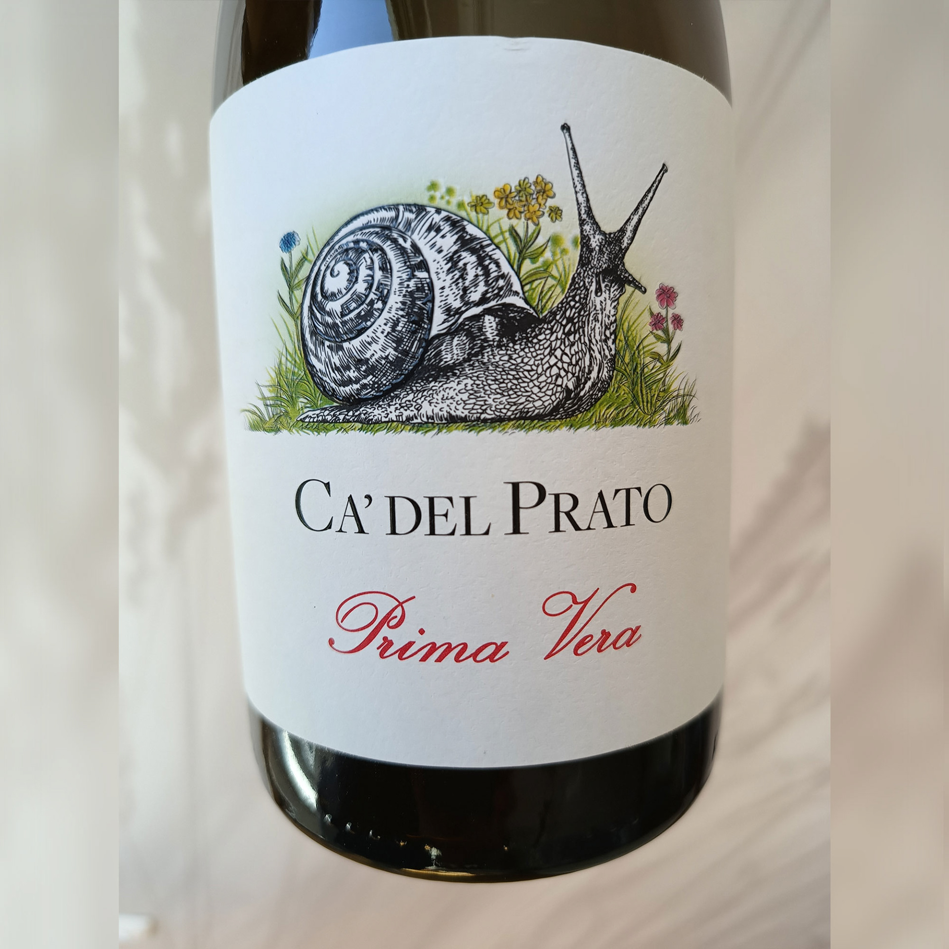
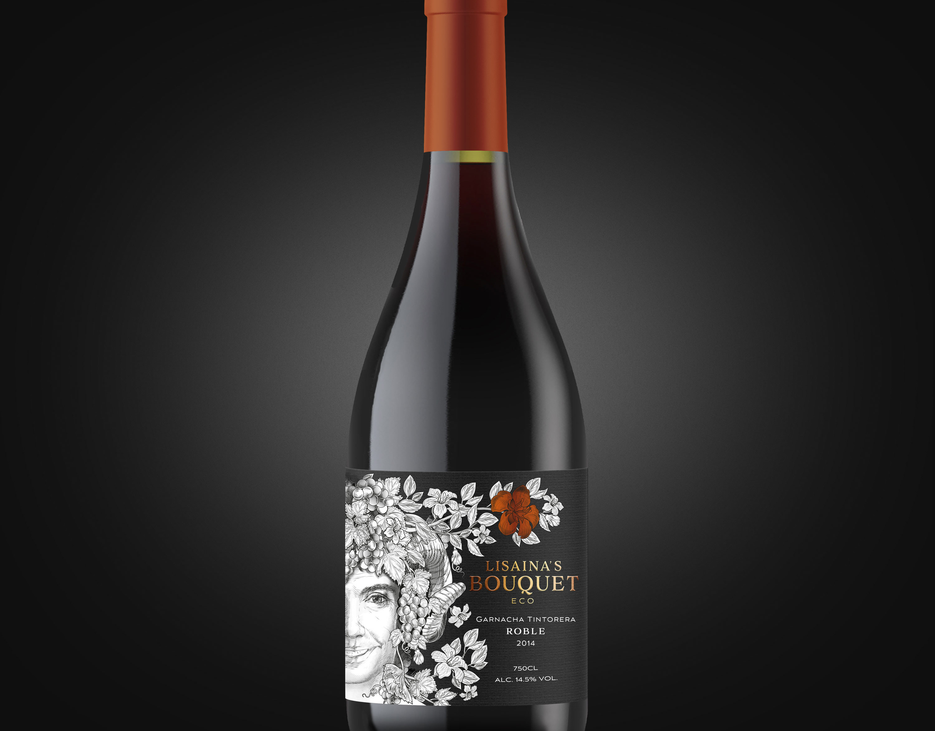
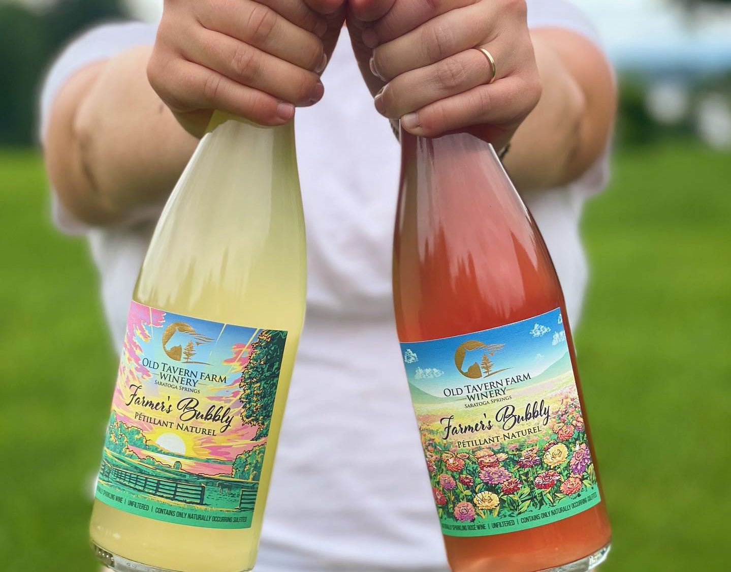
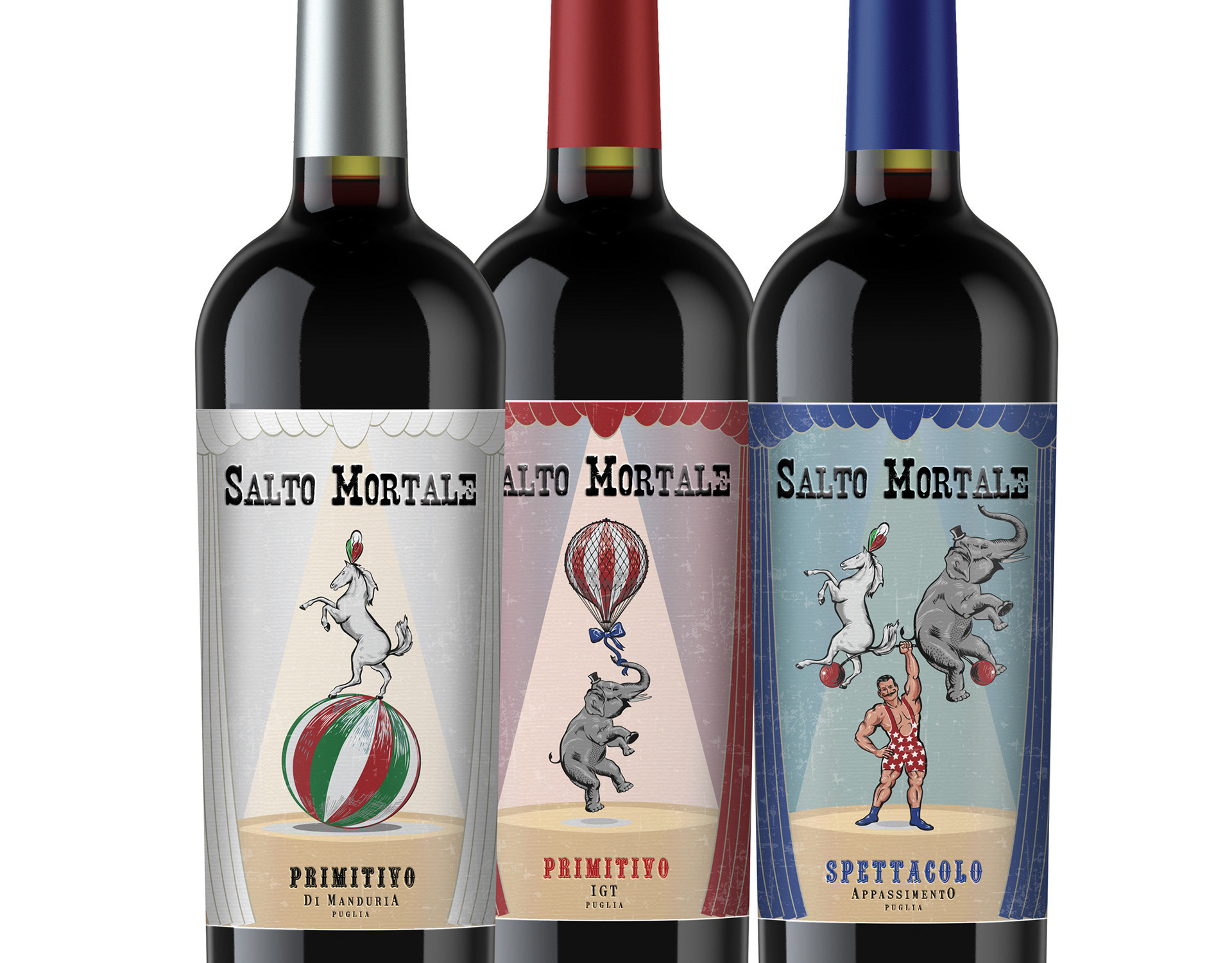
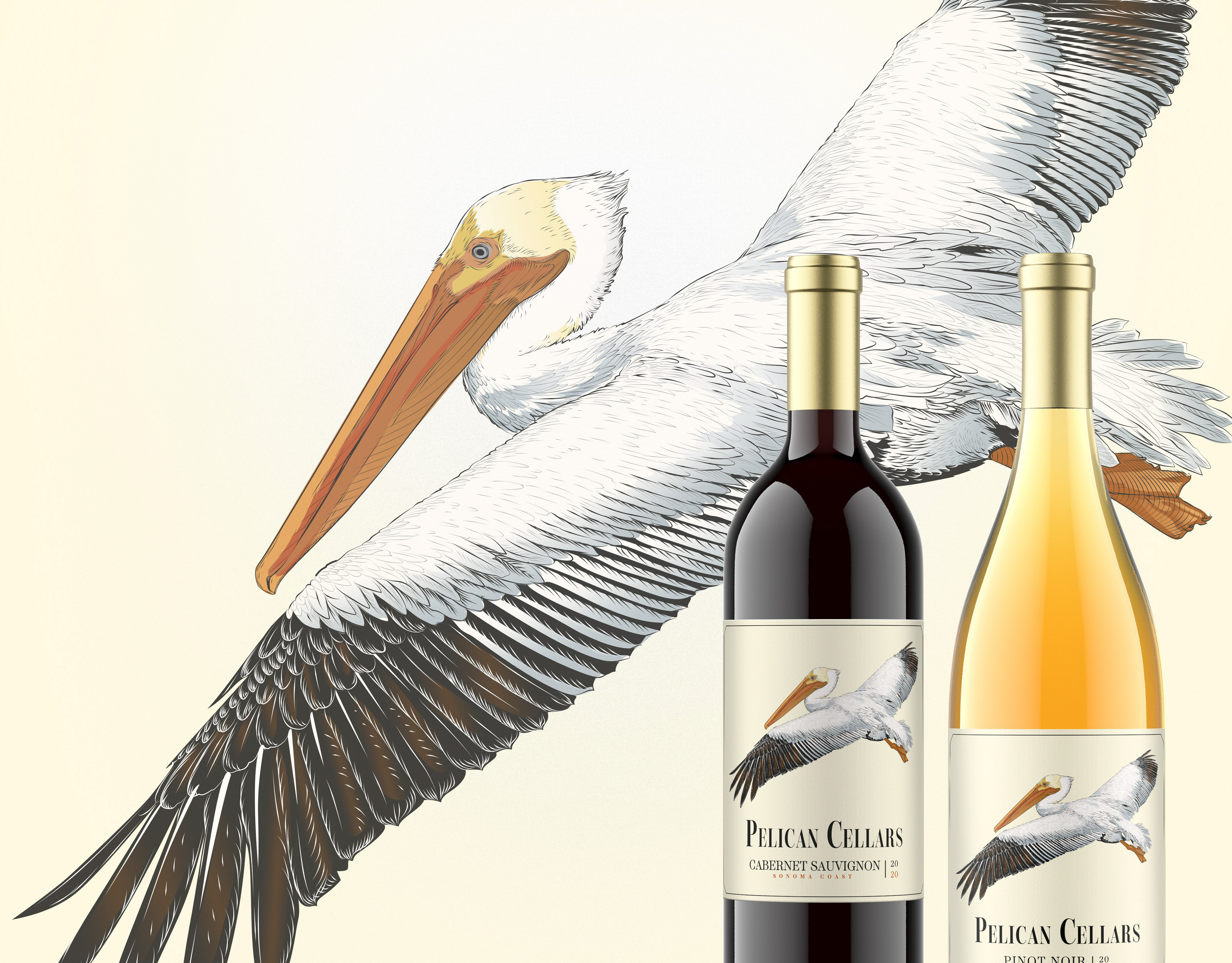
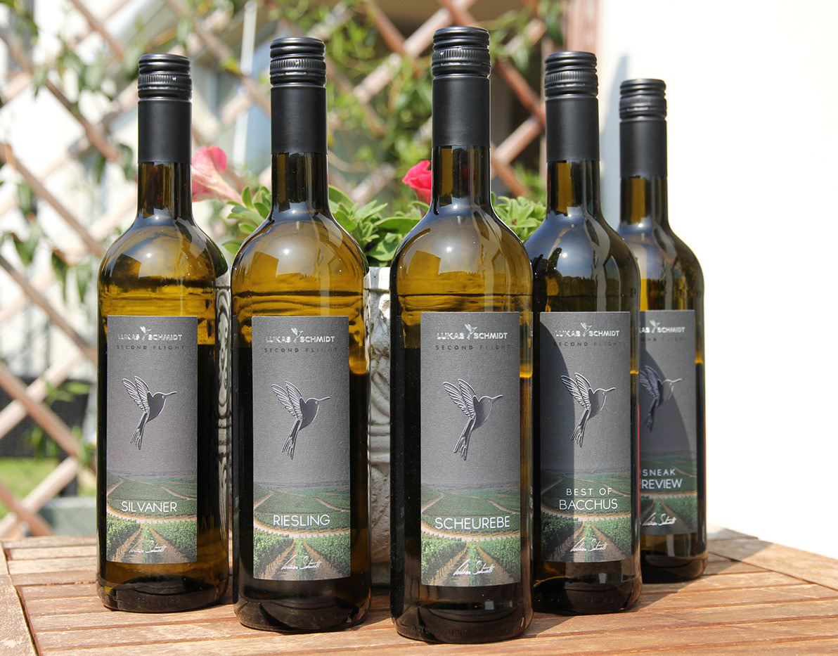
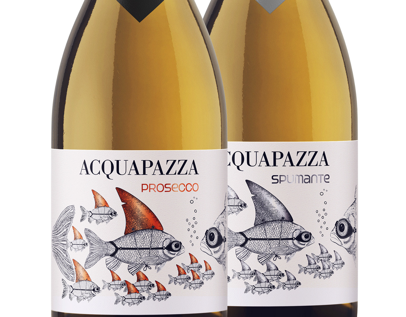
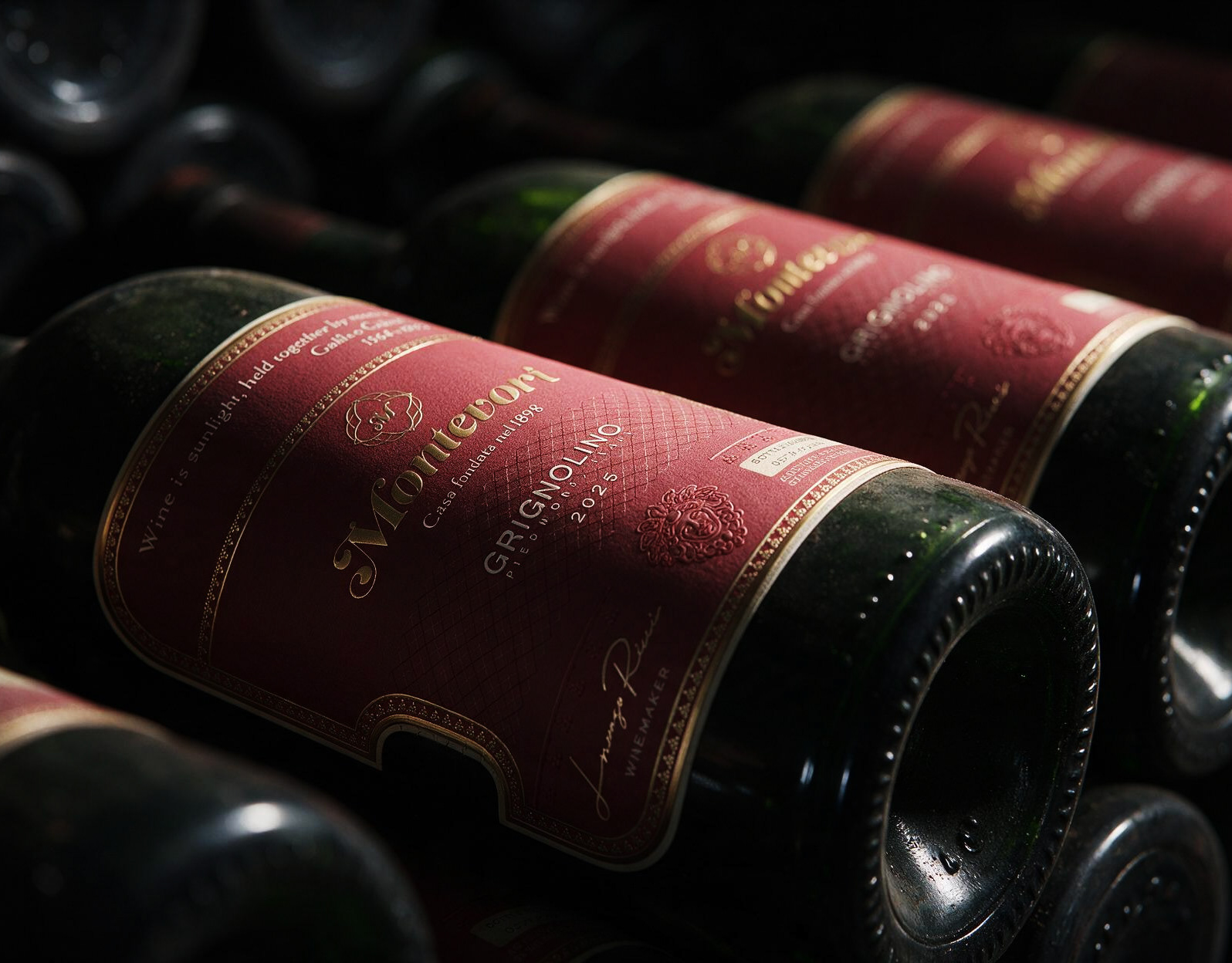
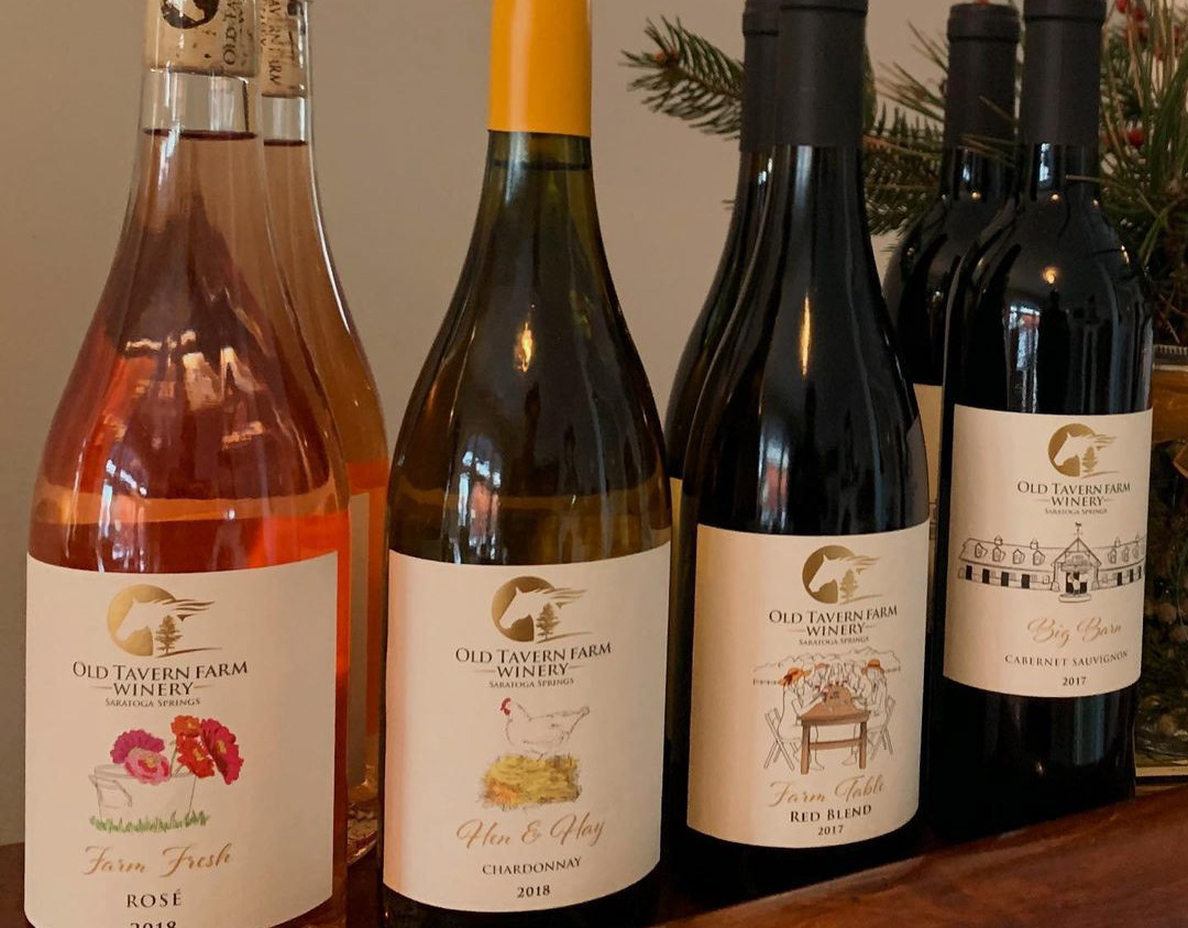
This is a photo of bottled wine and glued label.
_____________________________________________________________________
If you like our works, we’d be happy to collaborate and create premium design for your product. Feel free to reach out: team@premiumlabel.design / whatsapp: +420 776 246 535 or by using contact form below.
Thank you!