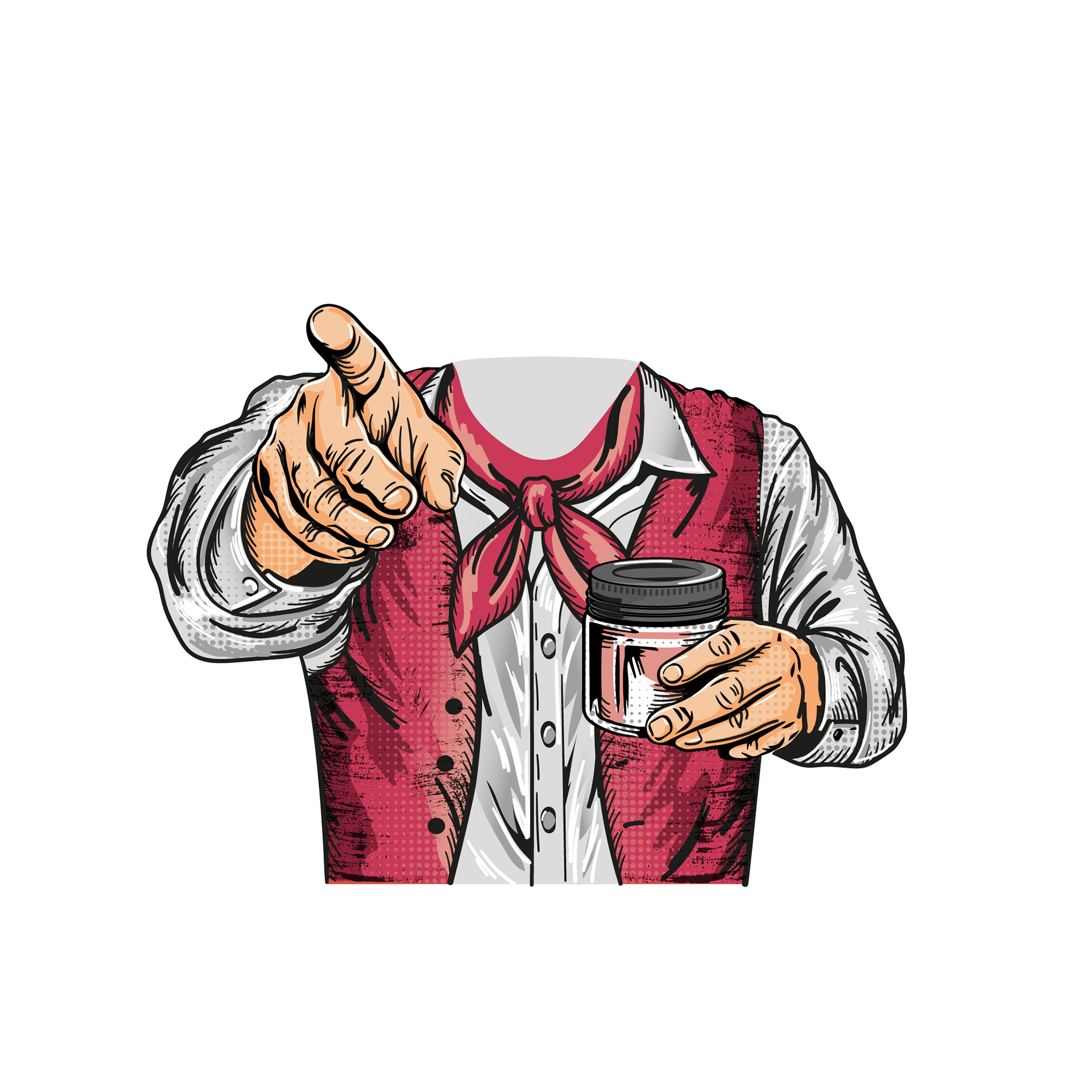
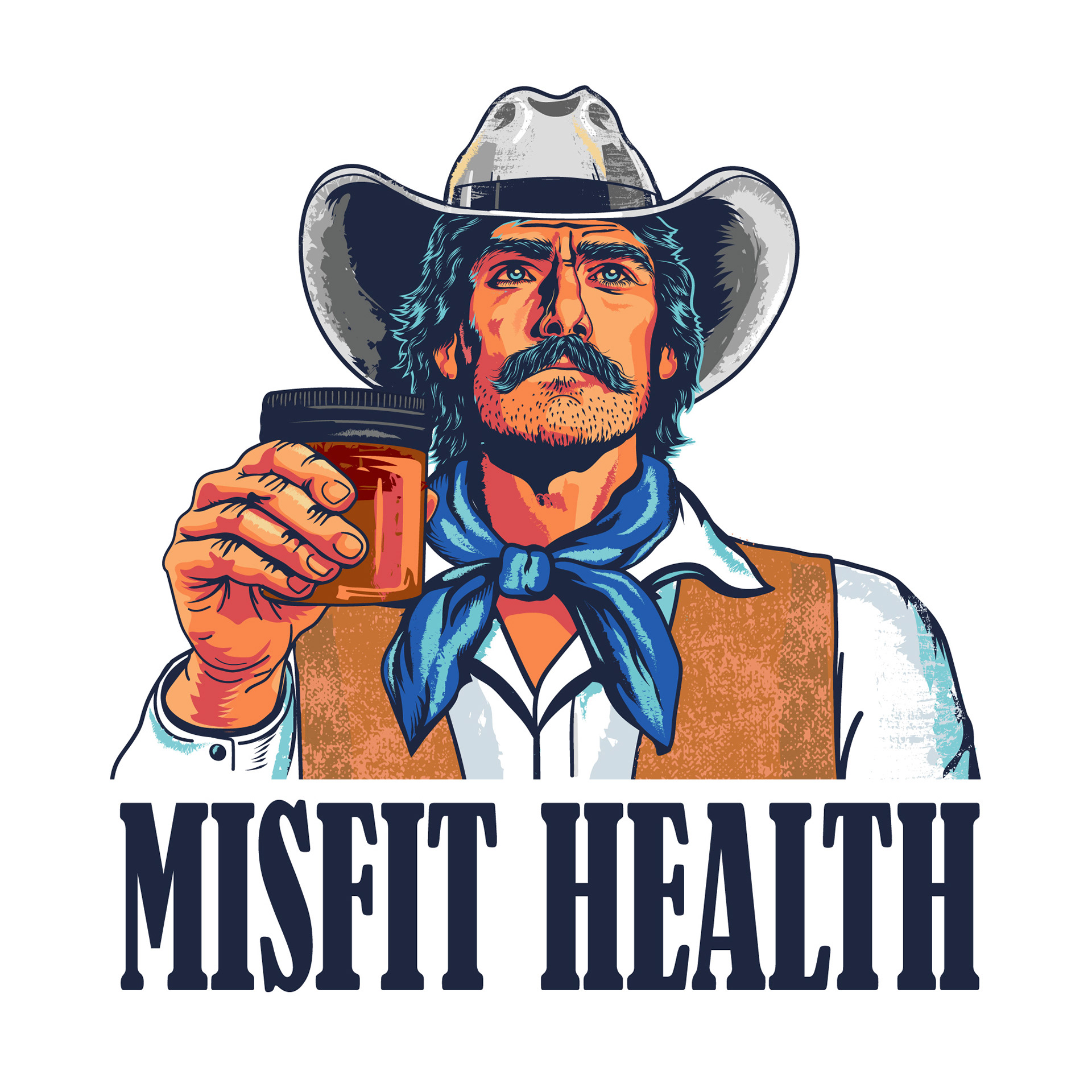
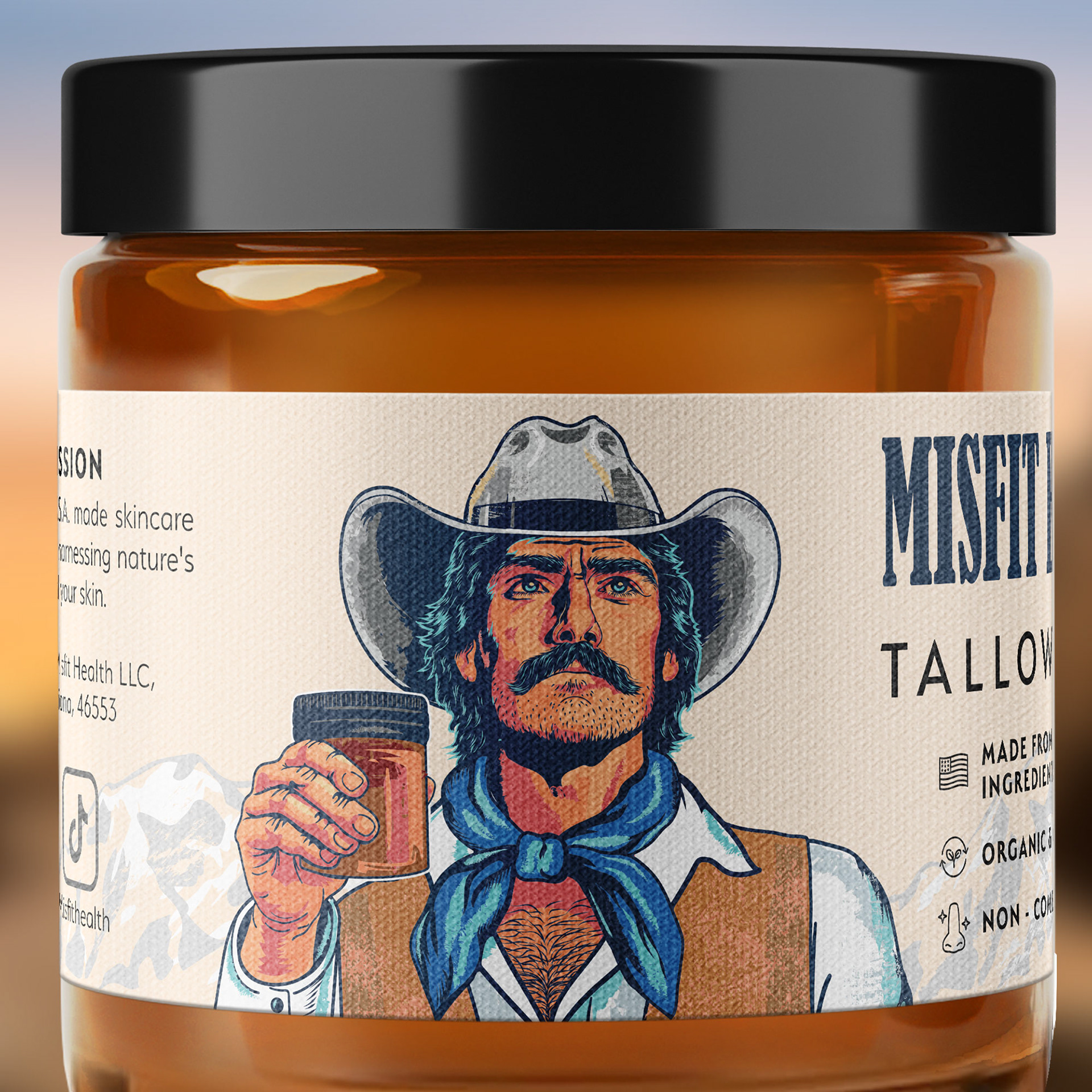
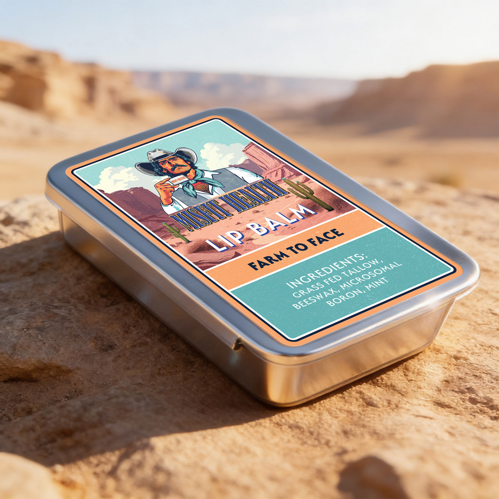
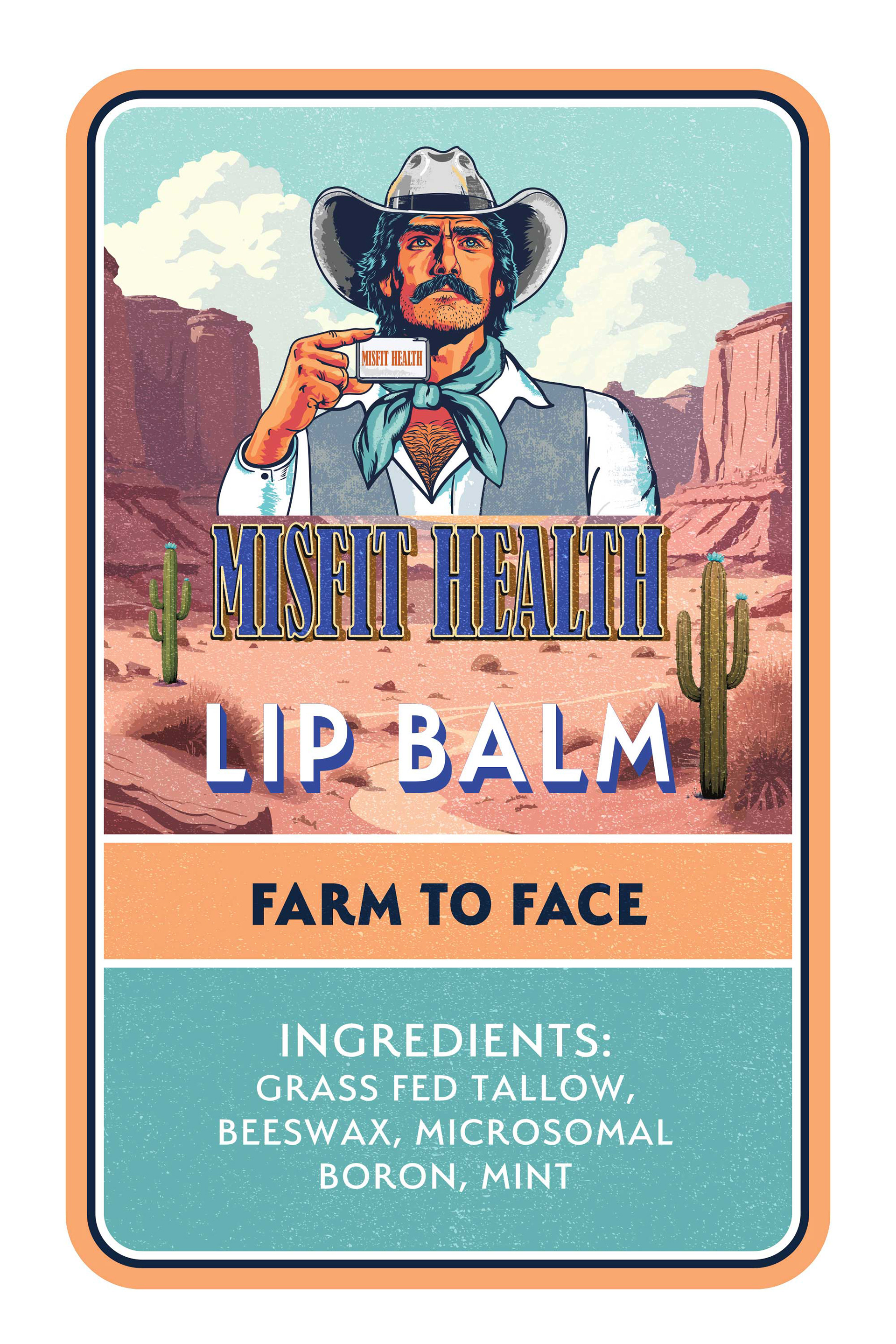
The visual identity for Misfit Health was developed around a bold, vintage-inspired Americana aesthetic, combining classic Western iconography with a modern handcrafted wellness brand approach. The logo features an illustrated cowboy character holding the product jar, designed to communicate rugged authenticity, confidence, and a rebellious independent spirit that aligns with the brand name.
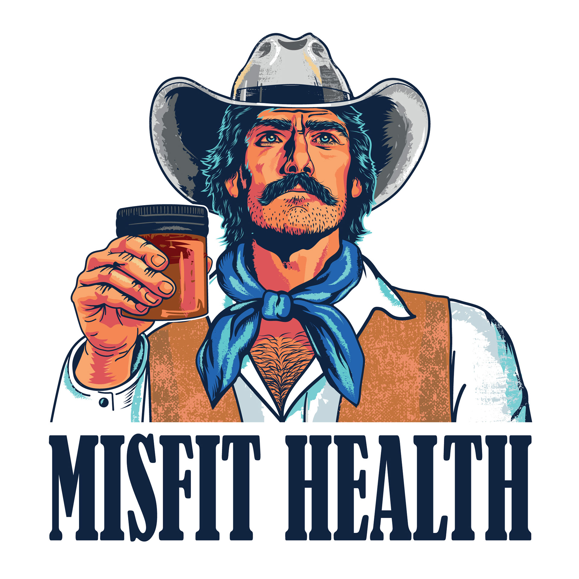
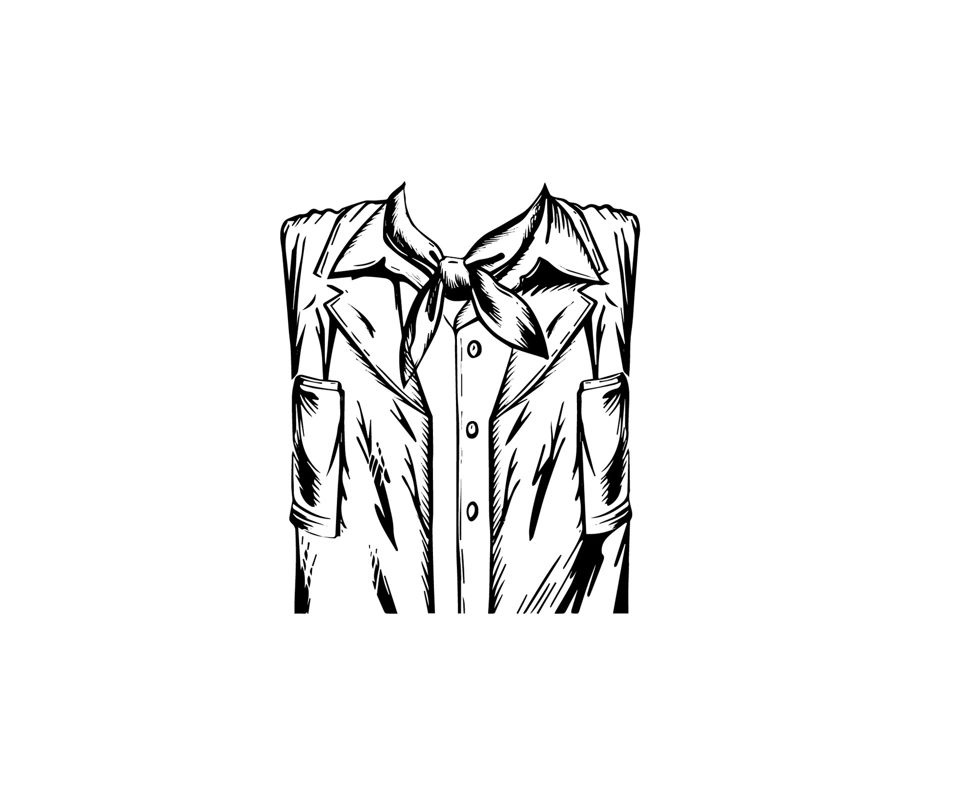
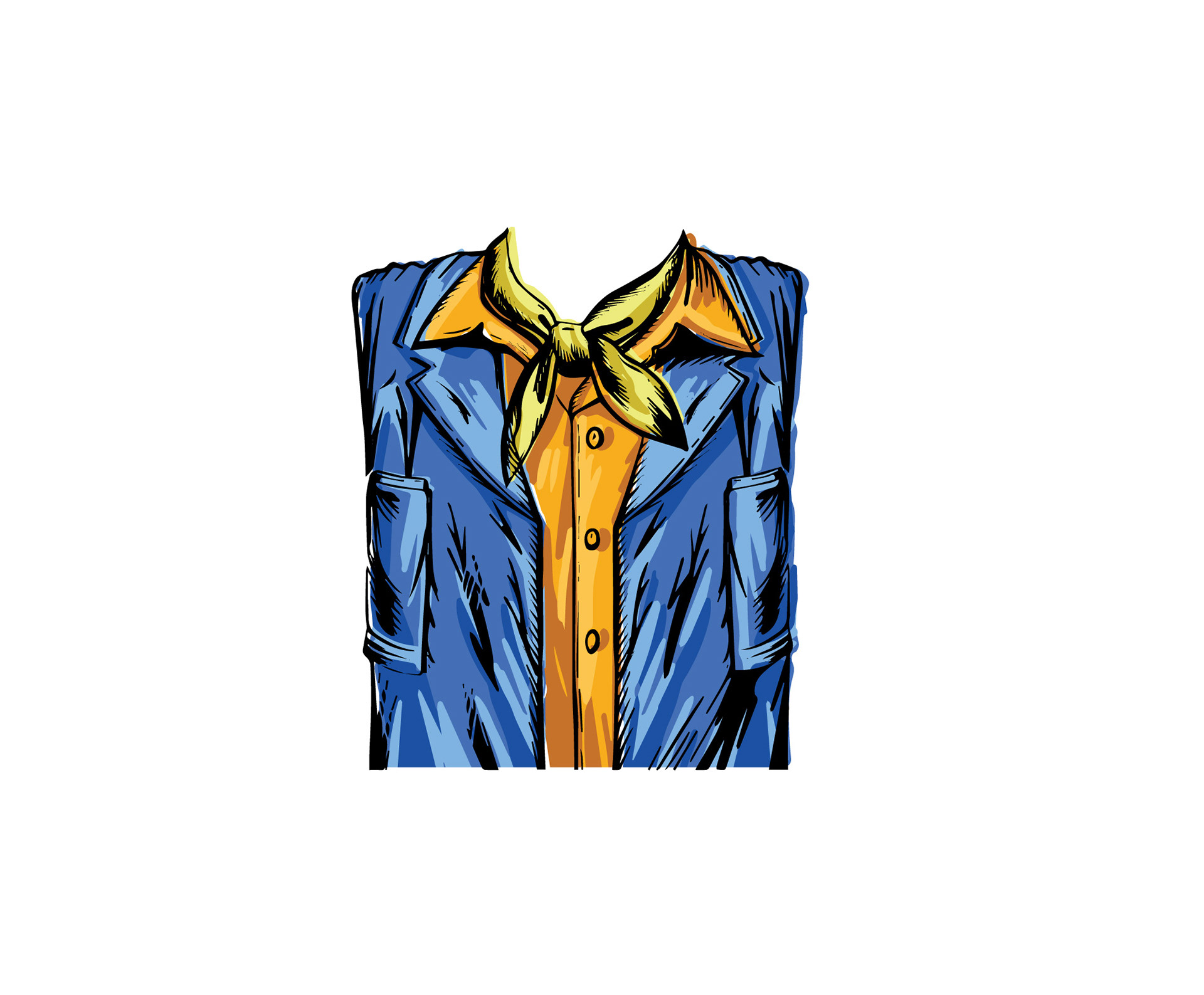
The illustration style draws inspiration from retro packaging graphics, traditional Western posters, and hand-inked commercial illustrations. Strong linework, textured shading, and a limited but vibrant color palette create a distinctive and memorable character while maintaining clarity and scalability across packaging and branding applications. The combination of expressive illustration and structured typography creates a balance between personality and product credibility.
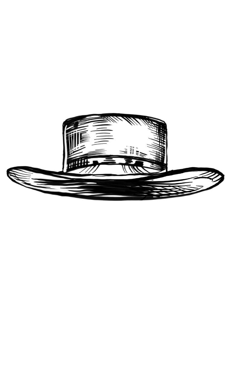
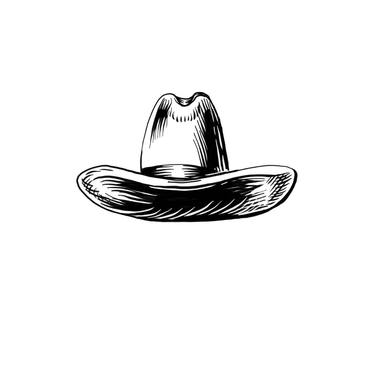
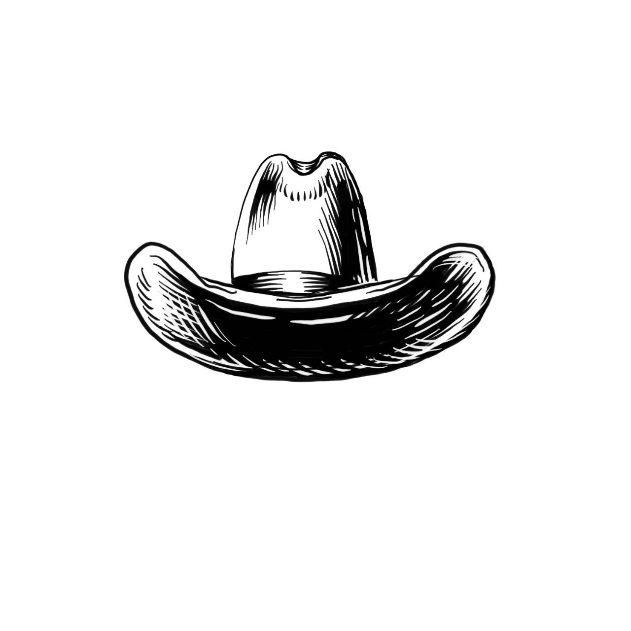
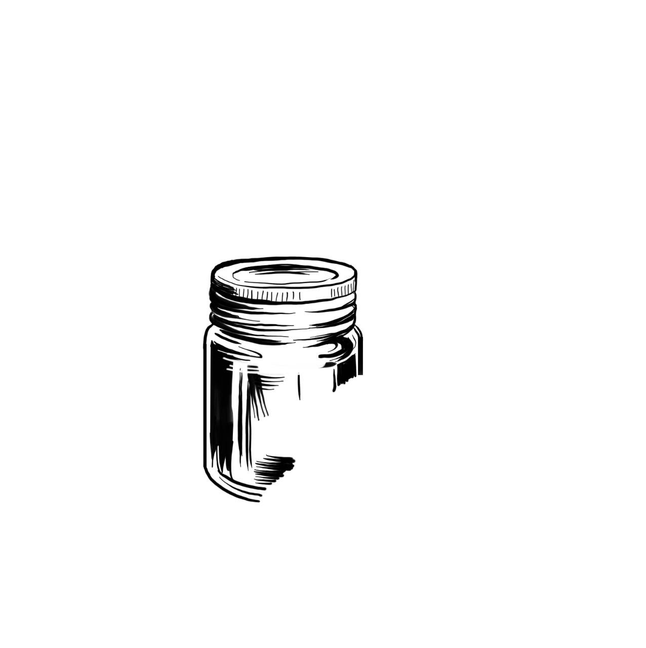
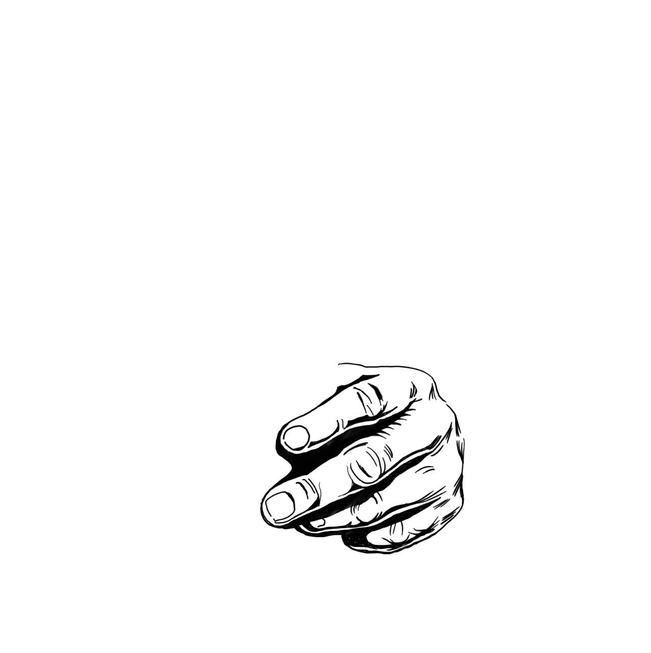
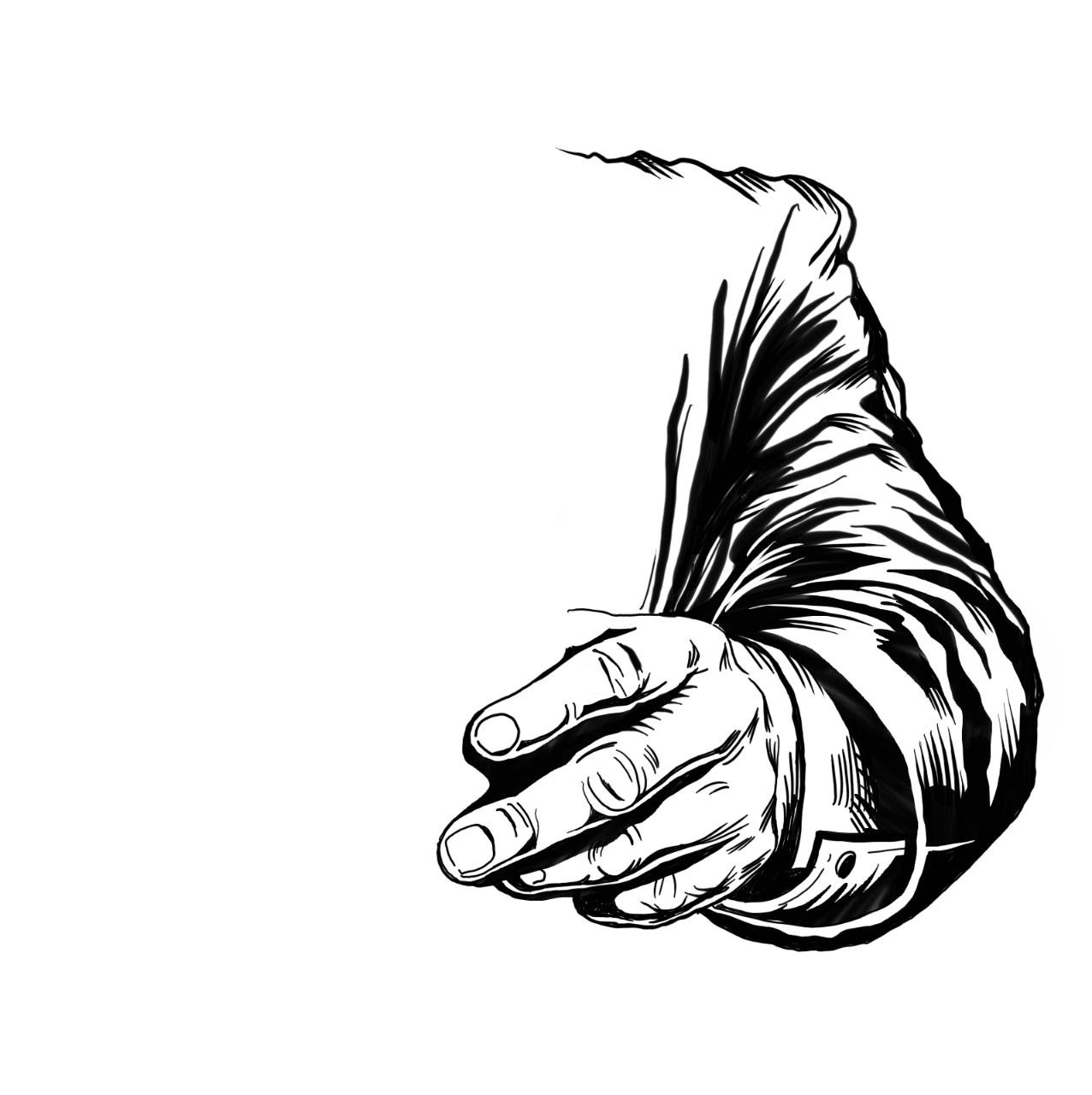
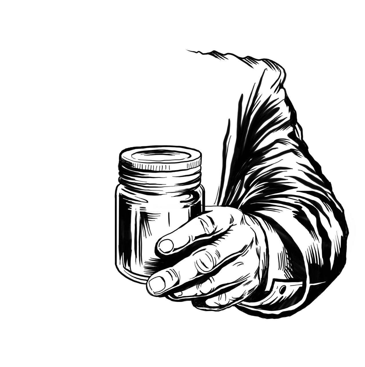
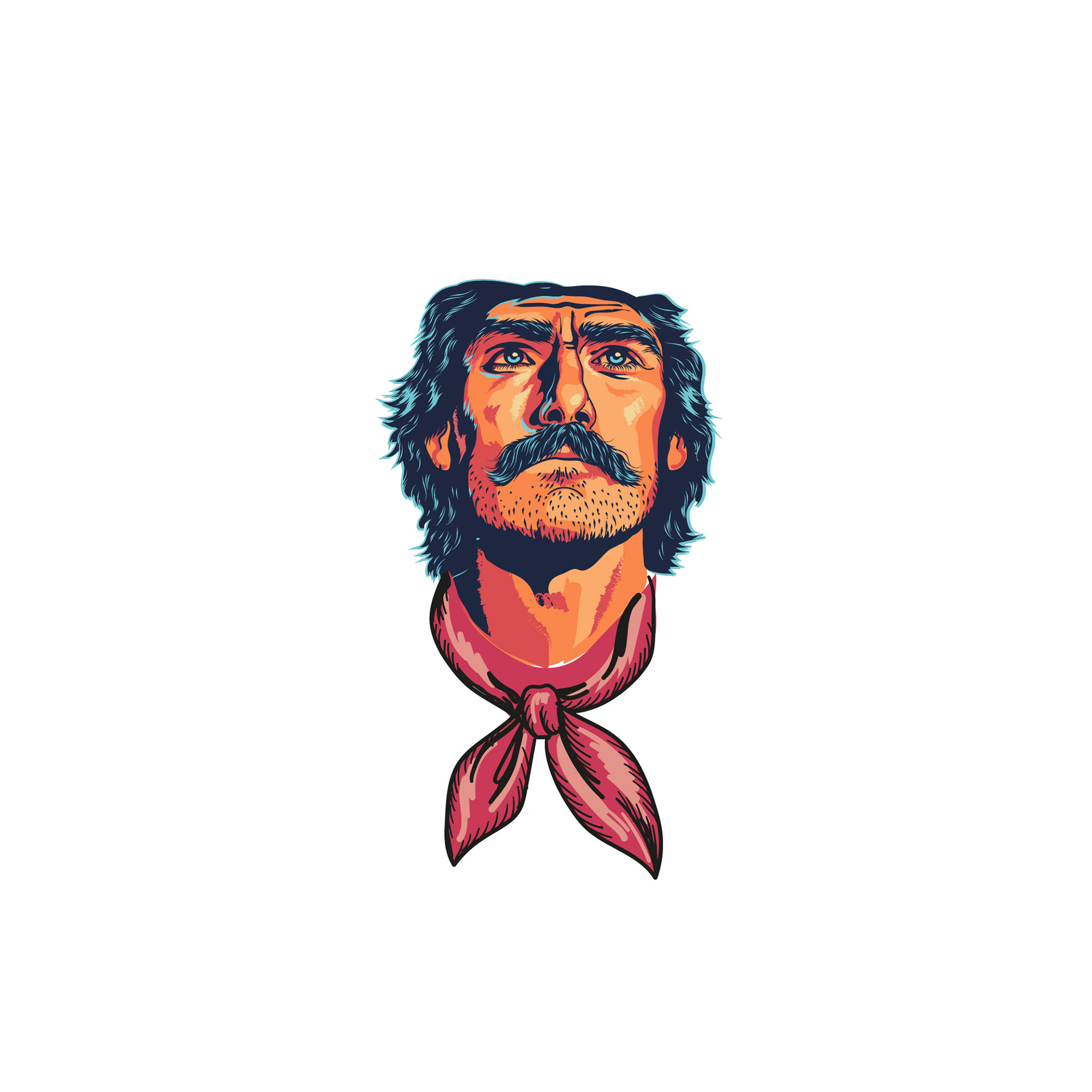
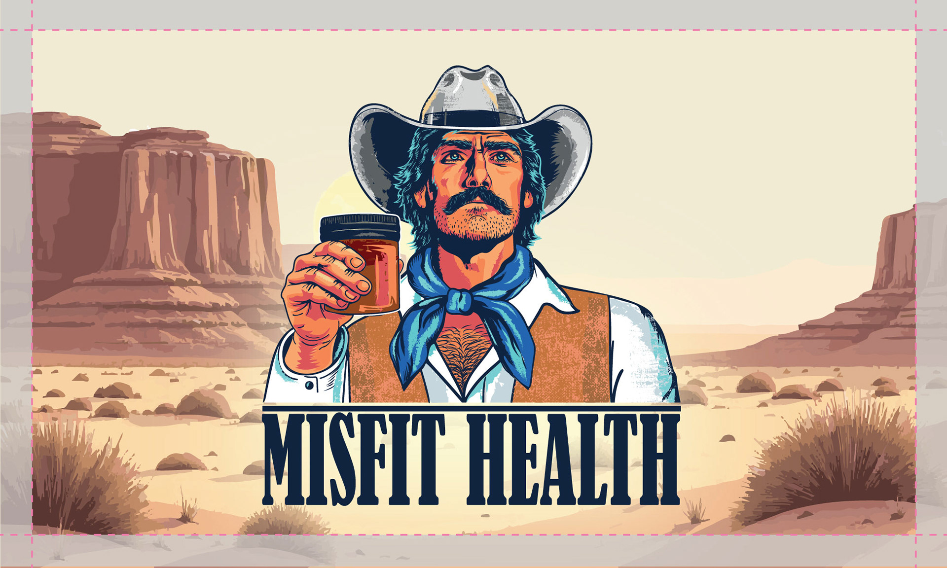
This visual study highlights the concept development of the male figure with a jar, serving as the foundation of the logo identity.
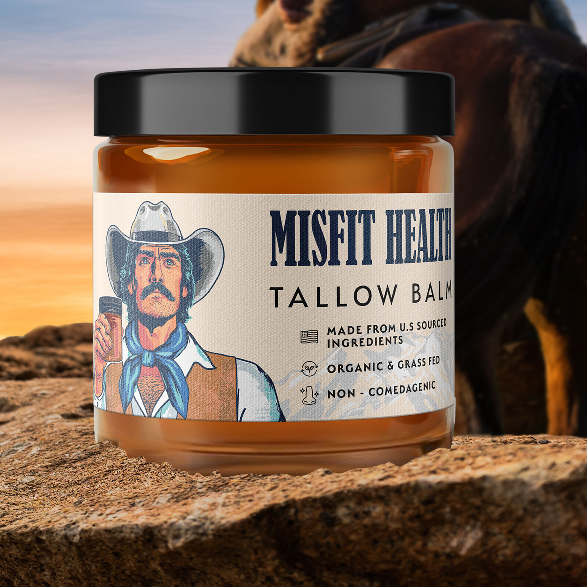
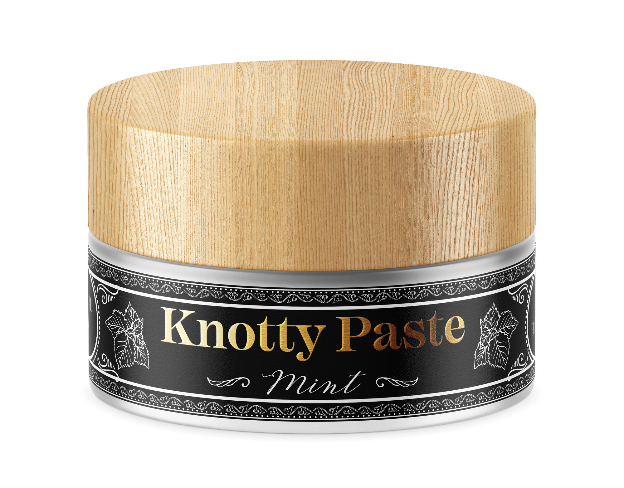
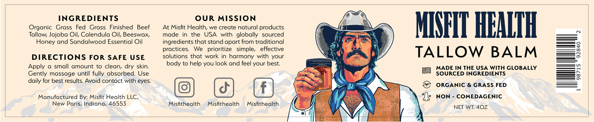
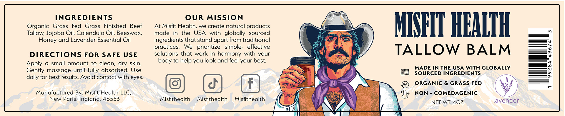
For the packaging design, the label system was created to emphasize artisanal quality and premium natural ingredients while preserving the playful visual identity of the brand. A warm neutral background paired with dark typography enhances readability and allows the illustrated mascot to become the central visual element. Supporting iconography and clean information hierarchy help organize product benefits without overwhelming the composition.
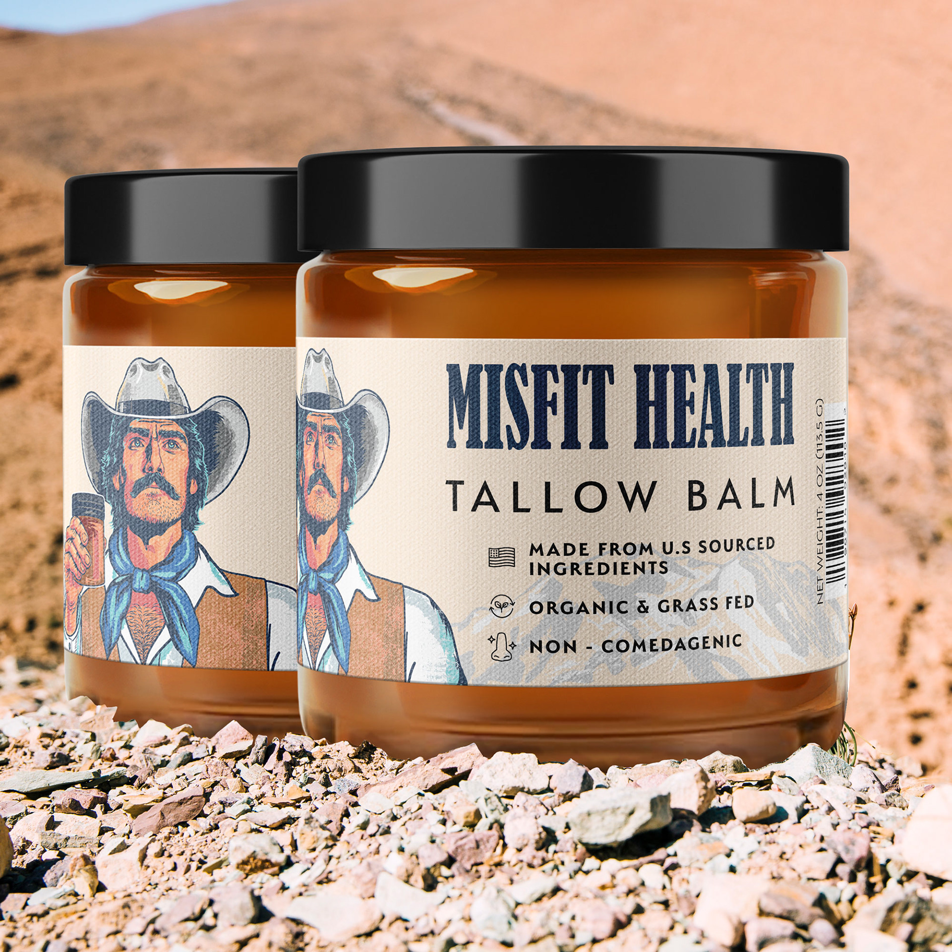
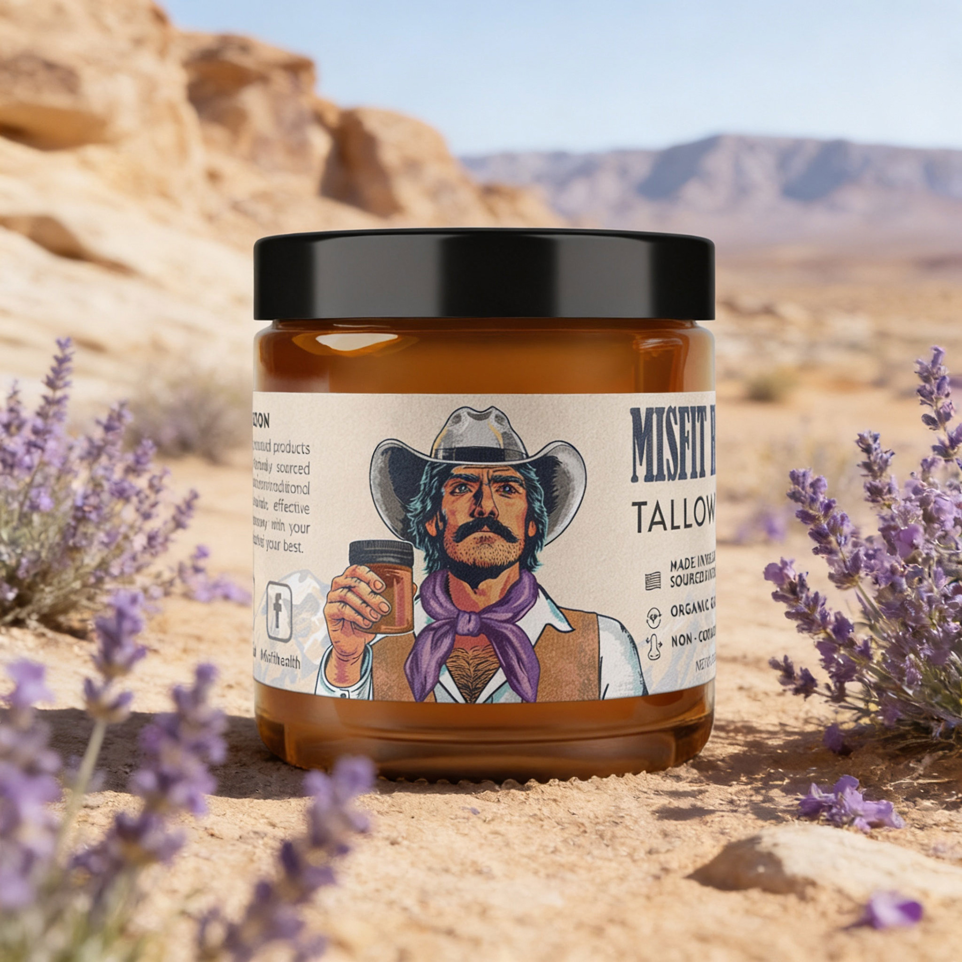
The overall design direction blends rugged masculinity, vintage Americana, and contemporary boutique wellness branding, resulting in a unique identity that stands apart from conventional skincare and grooming products.
_____________________________________________________________________
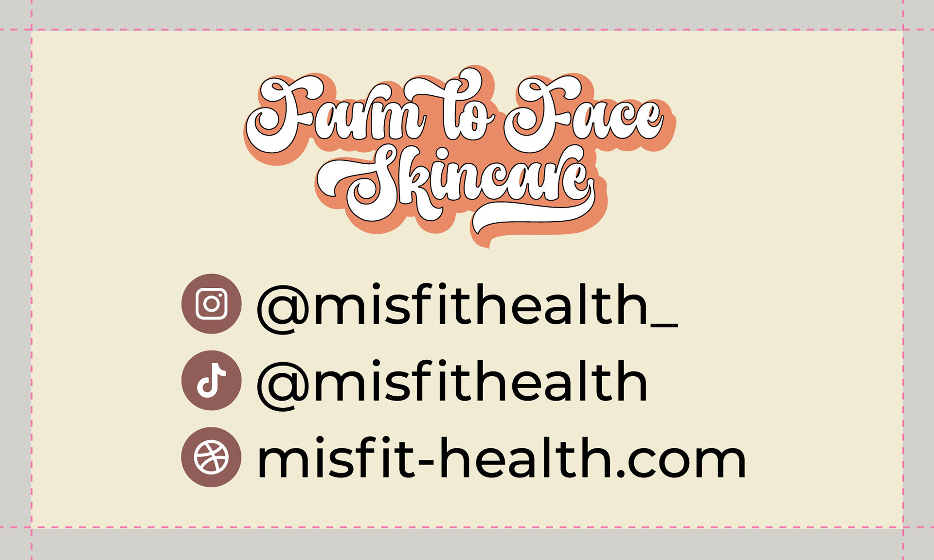
If you like our works, we’d be happy to collaborate and create premium design for your product. Feel free to reach out: team@premiumlabel.design / whatsapp: +420 776 246 535 or by using contact form below.
Thank you!