
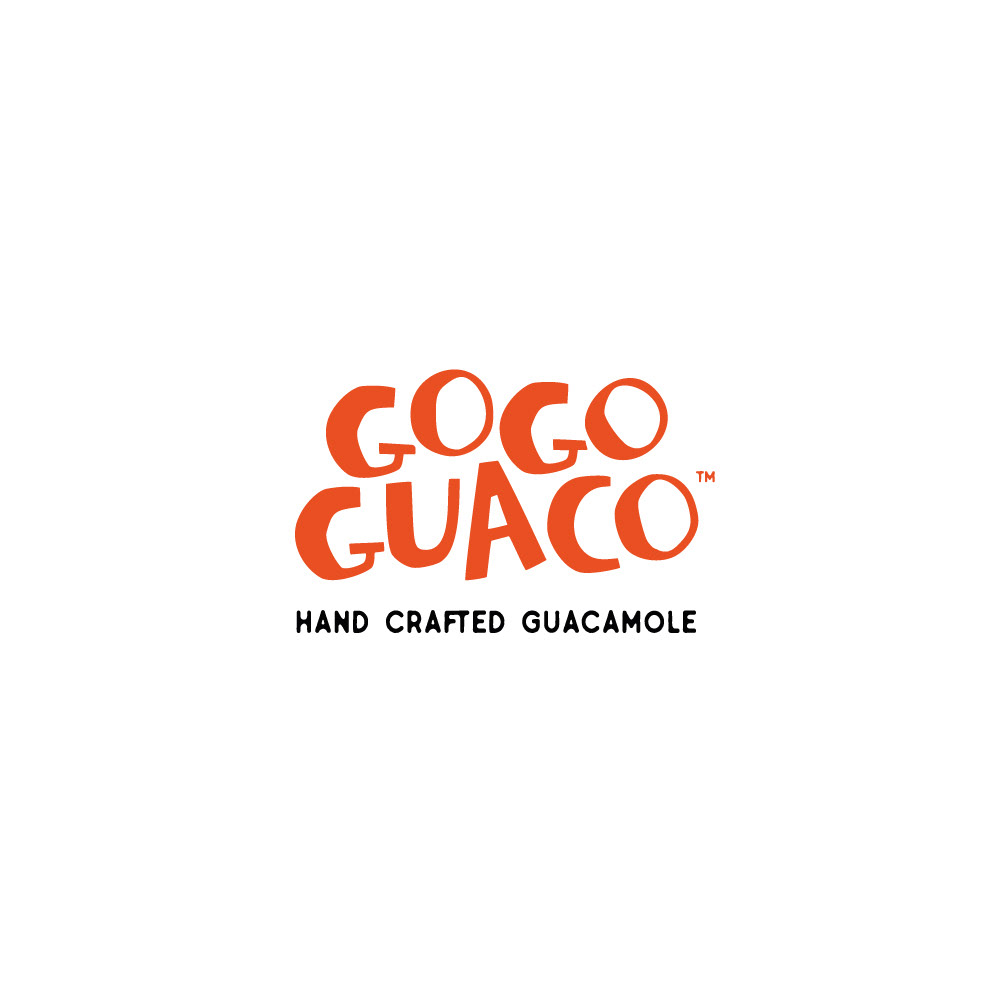
This playful and energetic logo was designed for a handcrafted guacamole brand. The bold, irregular letterforms in bright orange convey a sense of freshness, fun, and spontaneity, reflecting the natural and artisanal character of the product. The stacked, slightly uneven typography gives the logo movement and a hand-drawn feel, while the tagline in a contrasting, rounded font reinforces the crafted and approachable identity of the brand.


Feel free to drop us a line.
Thank you!