
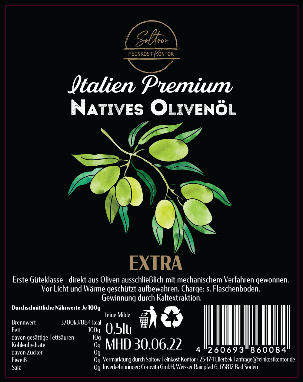
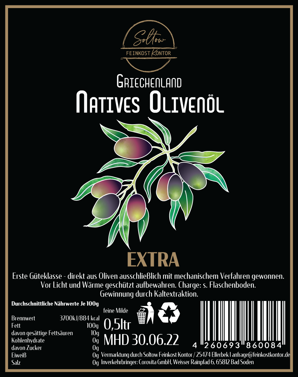
The composition combines classic typography with a hand-illustrated olive branch to emphasize natural quality and Mediterranean authenticity. A refined black background highlights the golden and green tones of the illustration, creating a premium yet organic look.
Design includes all mandatory product details, nutritional information, recycling icons, and barcode, prepared as a print-ready file for production.
Design includes all mandatory product details, nutritional information, recycling icons, and barcode, prepared as a print-ready file for production.
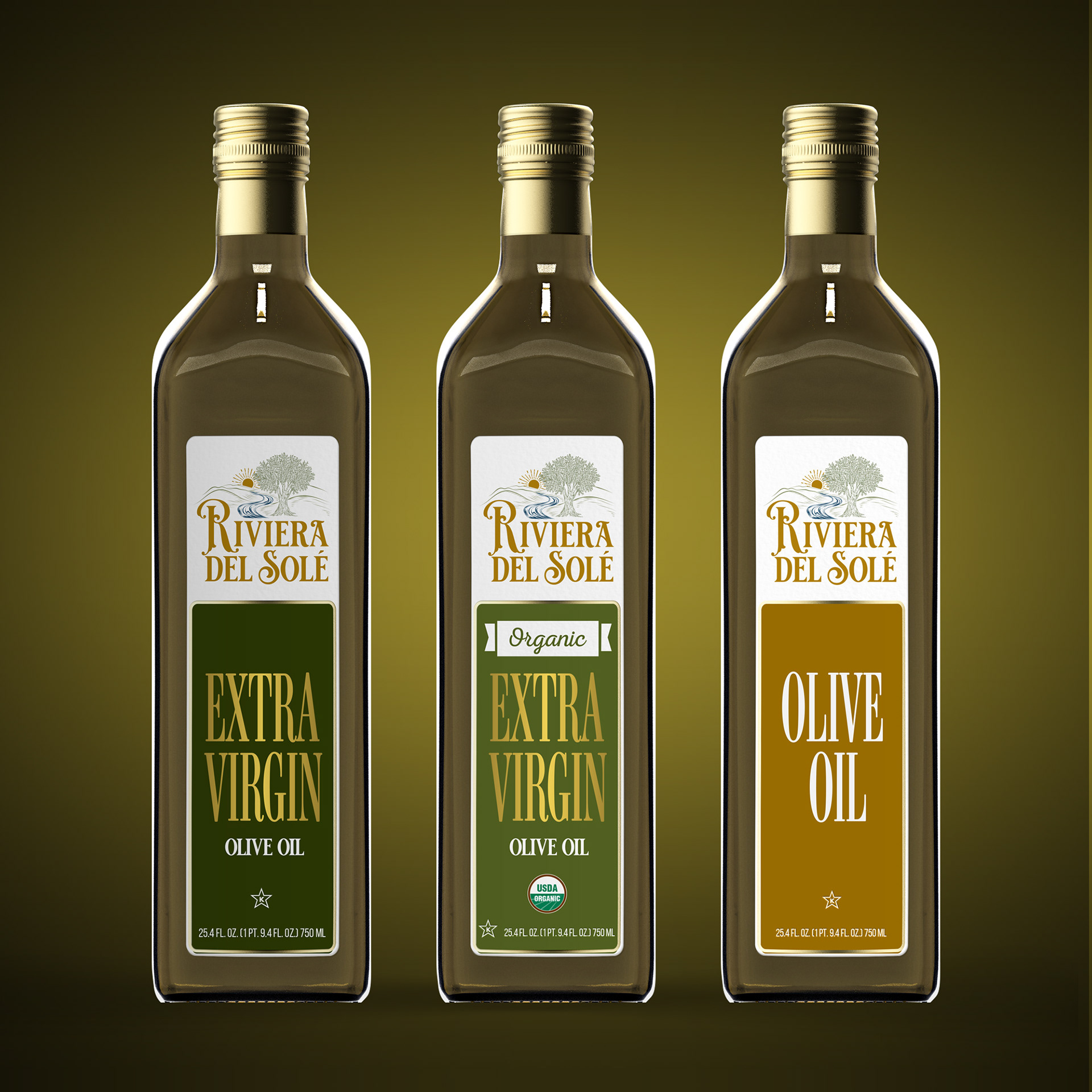
Label design series for the Riviera del Solé brand, developed to distinguish between product types while maintaining a unified visual identity. The design combines a Mediterranean-inspired logotype and olive branch illustration with warm, natural tones that evoke sunlight and freshness.
Each label variant — Extra Virgin, Organic Extra Virgin, and Olive Oil — uses distinct color palettes and typography hierarchy to ensure clear product differentiation. Created as a cohesive packaging system ready for print and 3D presentation.
Each label variant — Extra Virgin, Organic Extra Virgin, and Olive Oil — uses distinct color palettes and typography hierarchy to ensure clear product differentiation. Created as a cohesive packaging system ready for print and 3D presentation.
Feel free to drop us a line.
Thank you!